Colour forecasts for 2015 are starting to emerge, with trends going in opposite directions.
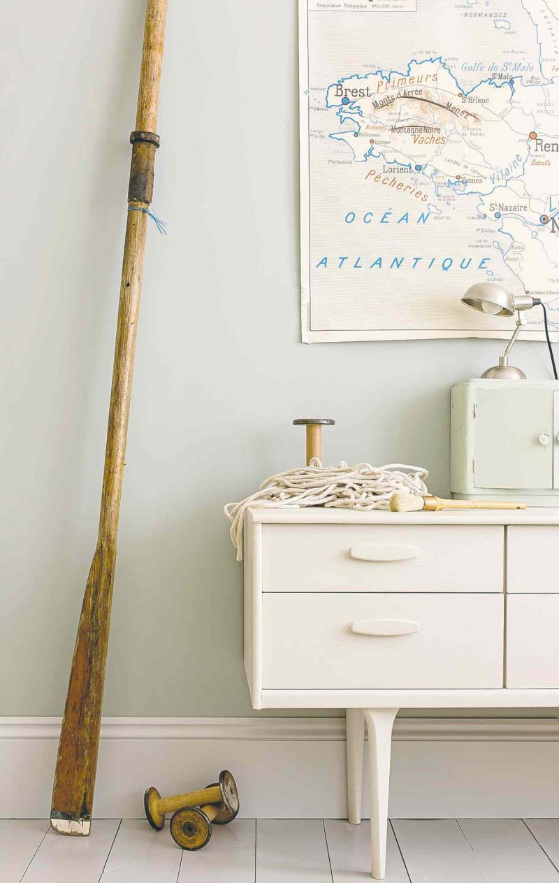
On the one hand, there's longtime British paint maker Farrow & Ball, predicting soft, comforting tones will be popular in the coming year to keep us grounded in "our increasingly nomadic working lives, where smart devices keep us connected wherever we are," spokesperson Rebecca Maclean says in a release.
Soft shades of green, blue and pink are the perfect antidote to our hectic lives and embrace current trends for warmer, more earthy interiors, she says. The hues are paler in appearance to help create calming spaces.
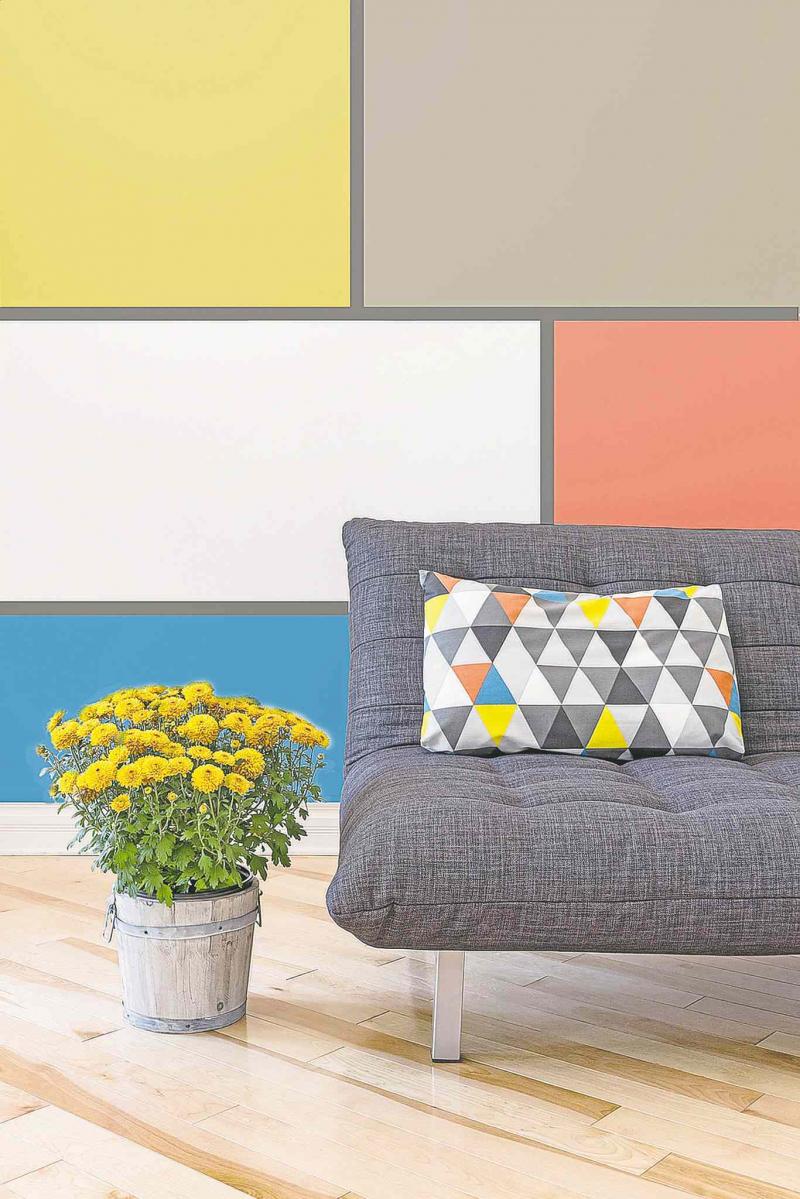
At the other end of the colour spectrum, the folks at Canadian paint maker Sico think we're looking for bolder, more expressive-looking homes in the year ahead.
"After years of playing it safe with neutral decor, Canadians are demonstrating more confidence in their colour choices," the company says in a release.
Its palette for 2015 emphasizes rich terra cotta, deep slate, aqua blue, fruity red and vivid jewel tones, with blues of all shades being a favourite in each colour group.
Marketing manager Mylène Gévry credits technology for the renewed interest in colour.
"People today are exposed to bright hues everywhere they go -- so we've become more comfortable with colour as a society," she says. "Even anti-technology types who prefer to stay grounded in nature tend to gravitate toward richer earthbound tones due to the colourful influence of the world around them."
Meanwhile, the global authority on colour, Pantone, has yet to reveal its colour of the year for 2015. That announcement is expected in the coming weeks. This year's colour was the vibrant radiant orchid.
--Postmedia Network Inc. 2014