Blue is still one of the most popular decor colours. It brings to mind clear blue skies and vast bodies of open water. This primary colour creates a feeling of serenity and comfort. After all, what is more comfortable than a great pair of blue jeans or more comforting than a slice of blueberry pie? Speaking of blueberries, the colour blue is found in only a few natural foods and for this reason it is thought to be the least appetizing. Blue is a cool colour so it's a good choice for rooms that tend to be warmer, like loft spaces or second story rooms.
The colour blue is also seen as trustworthy and dependable. Many corporations use blue as their signature colour to instil a sense of trust in their company.
In the home
Most shades of blue are considered gender neutral and are a good choice if you run across indecision in this situation. For their calming and cooling effects, pale blues are great in a nursery in and bedrooms. Casual spaces, like a rec room or family room, can benefit from denim blues, which give a sense of relaxation and fun. Blue may not be the best colour for the dining room or kitchen because of its effect on the appetite, though in small doses it can be a lovely accent colour in these rooms.
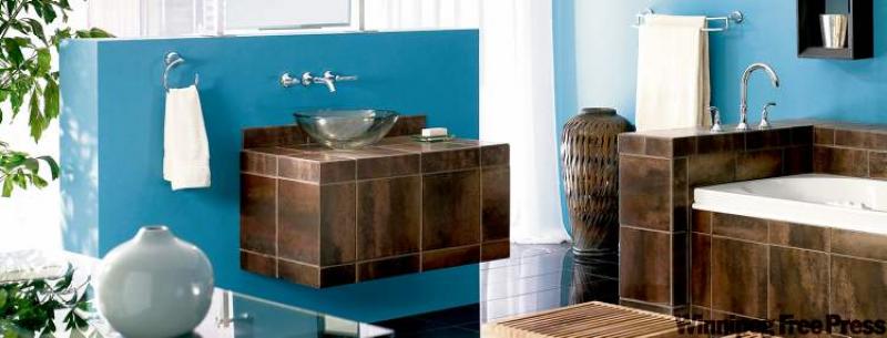
Blue is a great colour for the bathroom, as seen in our feature photograph courtesy of Moen. The lovely wall-mounted vanity in brown tile looks great against the blue backdrop. Because it's representative of water, blue can work in any strength in the bathroom, whether in lighter, robin's egg blue or in a navy blue representing a nautical theme. Blue is crisp, cool and refreshing.
Blue works well with many other paint colours. Pale blues look great with pale yellow, soft white accents, taupe and light-coloured furniture. Medium blues look great with yellow-greens, red, white and brown or rust colours. Dark blue, like navy, should be accented with white trim to keep the room from feeling like a cave. Red and shades of darker yellow also work well as accent colours with navy.
Gray blues can be very striking in the décor but can also be seen as gloomy by some. Use these shades in harmony with more cheerful colours like yellow, peach, pink and light orange or coral. Avoid using gray blues in dim or low light spaces.
Turquoise, which is blue-green, is a great colour that can be fun in a youthful, retro-inspired space. It's a colour that tends to have a love-hate relationship with people. Used in small doses, it definitely adds colour punch.
Blue is a great colour for a cottage or a home with a cottage style décor. Bead board panelling painted in a newport blue can create a lovely backdrop in a cottage style space. It represents water and is relaxing and casual in this type of setting. Even furniture painted in blue can add to the charm of a cottage décor.
Blue accents
Blue patterns in textiles, wallpaper and accessories can be a stunning addition to the décor. Delft blue pottery, blue and white toile, blue and white checks or stripes each have their own personality and can work in rooms boasting their respective styles. A country kitchen with butter yellow walls and blue and white checked accents can be a fun and cheery room; a bedroom treated to a toile wallpaper focal wall with matching blue paint on the other walls can be a calm and serene space that still has tons of personality.
Blue can be casual or formal, fun or serious, strong or delicate depending upon the application being used. This colour co-ordinates with many other colours so it's a great choice for the décor. (Have you ever found a casual top that doesn't look good with a pair of jeans?) Blue is a colour that is attractive on walls, floors, textiles and in accessories. Nearly all shades of blue are easy on the eyes so they can be used in larger areas with much success. In general, you can't say that about other colours, like orange or red.
Classic blue is great colour for the décor. Accent it with punches of bright colour for optimum impact.
connieoliver@shaw.ca