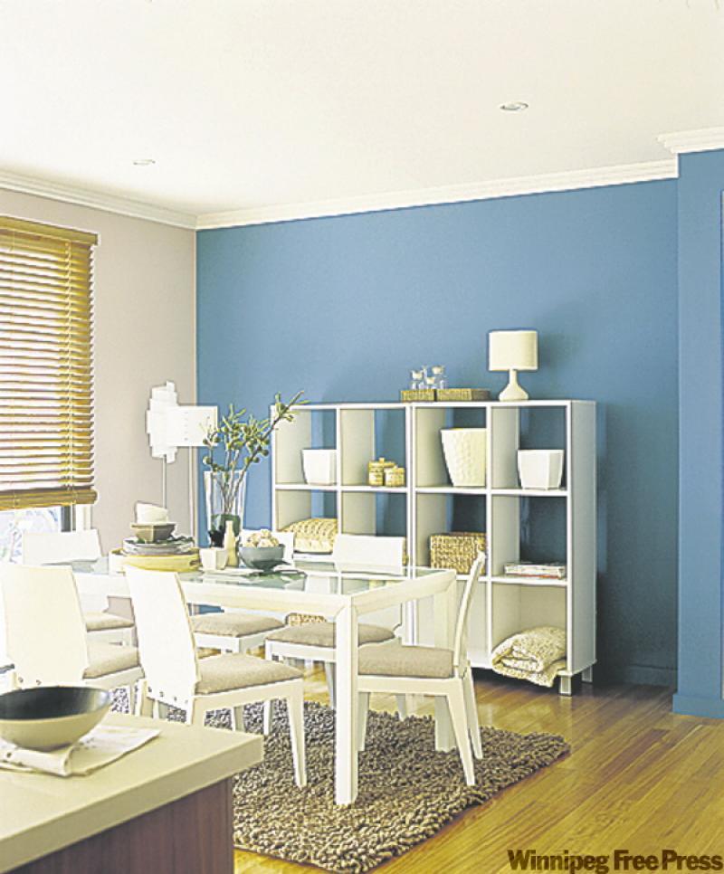
Dining in style doesn't have to be an expensive endeavour. Classy, casual dining has become the norm, thankfully. We are too busy these days to have a fussy, formal dining room but we still want the option of having a nice, sit-down dinner. The modern dining room can handle an after-school meal with kids as well as a proper dining experience for guests when needed.
As you can see from our dining room photographs courtesy of Dulux paints, even simple furnishings can be stunning with a good splash of colour behind them. The first dining room with the white furniture and cubed storage unit is almost IKEA inspired in its simplicity. Using a rich paint colour behind these furnishings makes them really pop. The lovely blue paint titled Pacific Shores along with the white furnishings has a casual French provincial feel. The wicker and wood accents along with the light pine flooring bring in a sensation of being at the beach. Between the two this room has a bit of formal mixed in with a casual flair. The décor provides the perfect balance that can be dressed up or down depending upon the circumstance. Add some elegant chair slipcovers, fine china and appropriate accessories and you're ready for an engagement dinner. Put out the plastic picnic ware, colourful placemats and childproof table accessories and you're ready for a fun, indoor picnic or birthday party.
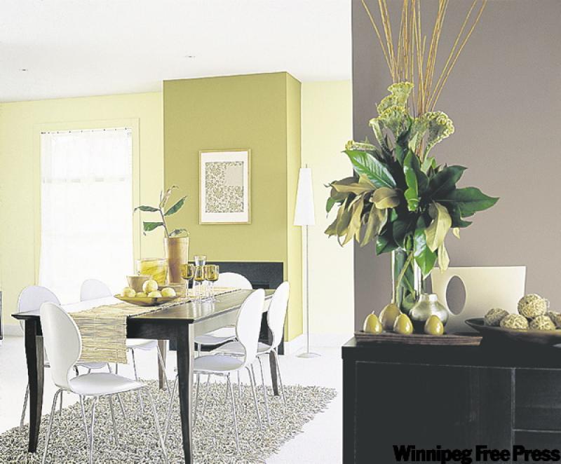
Our second dining room boasts a formal, modern dining table with retro plastic dining chairs. Again, a formal and casual combination. Adding the wicker table runner and fun area rug make this a more casual space. However, remove the area rug, table runner and, again, drape the chairs with elegant slipcovers and you're ready for a stylish dinner with friends. On the fireplace wall the aptly named paint colour, social harmony, adds depth and dimension to the room as well as creating a much-needed focal point. Having a strong colour on this wall also makes the fireplace more impressive.
As an aside, I wanted to talk about that odd fireplace wall. Many newer homes, especially those with open floor plans, have odd little wall spaces such as this three-foot wide jut out, which houses this fireplace. In your home it may be a freestanding wall separating the kitchen from the living room or perhaps you have a cavity that's supposed to house a china cabinet that you don't know how to decorate. As was done in dining room No. 2, paint these smaller areas with a splash of strong colour. Then, hang a large-scale painting on the wall which will effectively make a great visual statement. I'd go twice the size of the picture hanging over this fireplace with a painting that has vivid colour. Small artwork on a small wall just doesn't cut it. If you don't have a fireplace as in this picture, you may want to use a piece of furniture that fits the space, such as a small desk or credenza to sit underneath the painting. It all depends on your needs and your specific space but these are the areas where bold colour can be successful without a huge colour commitment from you. Use your artwork to give you a clue as to what colour(s) might work.
Be mindful of other elements close to the feature wall that may compete for attention. You'll note in this room that there is a floor-to-ceiling window to the left of the fireplace wall that is almost the same size as the fireplace wall. If the designer had opted for a rich-coloured window treatment it would definitely have been in visual competition with the focal wall. Instead, the designer opted for a soft sheer curtain that doesn't detract from the focal wall. So, if you have a wall cabinet beside your focal wall you may want to find another place for it if it's overpowering your focal wall. If you choose to use a strong colour on these odd wall spaces use a lighter shade or complimentary shade of paint on the receding wall. Don't leave them white unless you're going for a black-and-white theme. The wall colour on the recessed wall in photo No. 2 is a buttery yellow that compliments the khaki green on the fireplace wall. Strong wall colour works best when it's set against white- or light-coloured trim; the bigger the better. If you don't have substantial trim you can use the trick that I've mentioned in past articles to enhance it using paint and half-round trim (email me if you can't remember). If your trim is dark, be mindful of how it will look with any rich wall colour you may consider using. You may need to paint the trim out to garner success with the outcome.
Great dining should be elegant and relaxing. After all, it's all about the food and the company in the end.
connieoliver@shaw.ca