Choosing colours for your home is one of the tougher decisions to make. I think it's partly because we have so many paint colour options. There are literally millions of colour combinations to choose from, which can be a little overwhelming at times. To ensure success it helps to begin with what has worked in the past; whether it was in your home or a colour scheme that you've seen in a photograph. If you don't know where to begin when it comes to colour there are a number of simple things you can do that will set you on the right path to colour success.
Combinations that work
As I've stated before, a great piece of fabric can be an inspiration for your entire room. Use the colour combination in any fabric that is visually appealing to you as your colour scheme. Two, three or even four colours found in a fabric pattern are colours that you know will work together. Then use the quantity of each colour (how much of each colour is in the pattern) as a guide to how the colours will play out in your space. For example, you're repainting your master bedroom and find a fabric pattern with a medium brown background, large soft pink cherry blossoms, a bit of cream and a hint of blue. Brown is the prominent colour and should be considered for larger areas of the room, like wall or floor colour and/or bedding. This is where your tastes come into play. Do you want a warm, cosy cave to sleep in or something a little lighter for the walls? If your furniture is light cream or white, the dark wall colour could be smashing. If you have dark furniture and dark flooring then the lighter colour of the soft pink cherry blossoms for the walls might be a better option. The fabric colours with less prominence can be used for door and window trim (cream) and accents colours (blue accent pillows on the bed). You may also find your colour scheme in other items like wallpaper patterns, artwork or even patterned china.
Nature
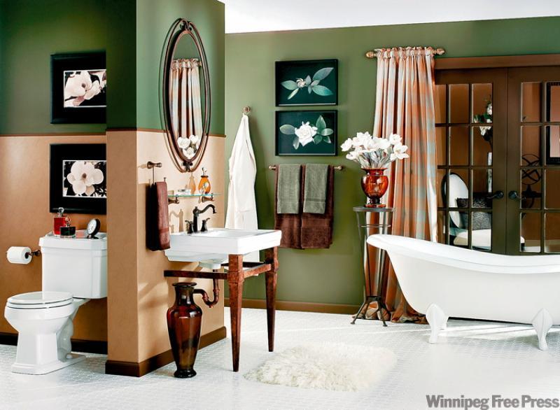
You can't go wrong if you choose your colour palette from nature. Rich, warm colour always makes a room feel inviting. Whether it is the sand tones of a long stretch of beach, varying green hues from a forest teaming with foliage, orange and purple from a spectacular prairie sunset or the hues of sky blue on a clear winter day, nature has a lot to offer the DIY decorator. As you can see from our feature photograph, courtesy of Moen, this lovely bathroom has a lot of character and warmth which is mostly due to the earthy colour palette of green and a peachy sand tone. The lovely soaker tub doesn't hurt the look either, that's for sure. Even the sink has a natural finish base which supports the overall earthy theme. The Vestige oil rubbed bronze fixtures speak to the overall theme. It's great to be able to purchase items like this styles that suite ones tastes and support the overall design plan.
Playing with colour
Once you've chosen your colours you then have the creative task of deciding how to use them. In this room, two-toned wall colour helps visually define certain areas of the room. This technique can make a small bathroom feel larger as well. I use this treatment in my own small bathroom with the bottom third of the wall in a light paint tone and the top two thirds of the wall in a botanical wallpaper print. It's easy to change the look by simply replacing the wallpaper every few years. One double roll of wallpaper from the clearance bin usually does the trick and is a quick weekend project update. (If using this technique, don't divide the wall in half. Use the one third, two thirds rule. Dividing the wall in half will make the space feel smaller and visually confusing.)
You could paint the entire room in one colour or the other but using this half-wall treatment adds tons of interest and keeps the room from feeling too dark. As an aside, the lighter peach colour is making its way back into the popular colour wheel again. It's a fresh take on the former peach tones from decades past and works well with many colours.
Choosing artwork and accessories
The colour palette in our feature room could easily have come from the artwork in the room. The forest green is found in the background paintings while the softer peach colour can be found in the two prints hanging over the toilet. Playing it safe with brown frames and/or matting would have been fine but the charcoal mattes and frames make the artwork pop. There are quite a bit of wood elements in this room all ready so opting for the more up-to-date black frames was a good choice. If you're choosing artwork after the painting has been done, take the paint chips with you so you'll be sure to have a good match. Remembering exact colour is just about impossible so plan ahead.
You can have fun with accessories and bring in that small accent colour you may have found in your inspiration fabric. Depending upon the room, a pop of a vibrant colour, like red, can add tons of character to a room. Our feature room is pretty much tonal with no visual surprises but that works in a room where you want serenity. In you're working on the living room or recroom though have a little fun with colour in small doses.
I'd like to take this opportunity to wish you all a Happy New Year and I look forward to sharing ideas and decorating successes with you in 2010. Keep those emails coming.
Connieoliver@shaw.ca