As the weather turns cooler, Canadians tend to warm up to paint. That's the finding of leading paint brand CIL, which reports it has seen strong fall paint sales over the last several years.
"August and September have become huge months for painting," said Alison Goldman, brand manager for AkzoNobel, makers of CIL paint. "While in reality, interior painting season is any time thanks to new eco-friendly paints that don't even require open windows for ventilation, many people still seem to choose the fall months to paint when the air begins to get cooler."
Explaining that the motivation to paint in the fall is often spurred by a desire to provide a fresh start for kids going back to school, or to prepare for long-weekend guests, Goldman says "next to Christmas, Thanksgiving is a huge entertaining time and, for many, a perfect excuse to give rooms a lift."
With the popularity of autumn paint projects, CIL has unveiled its palette of hot fall colours for this season. Leading the trend are yellow-toned reds and oranges, and green-toned blues and purples.
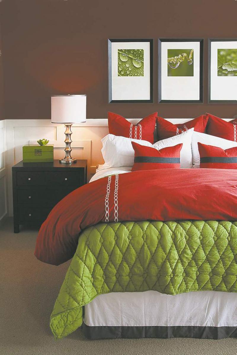
I love the stunning bedroom in our feature photograph. The CIL paint colour combo is both rich and airy. This is due in part, to the clever use of two highly contrasting paint colours, which strategically divide the wall surface. The very dark and rich colour on the upper portion of the walls (CIL's classic liberty red) provides an intense depth of colour, which will nurture and cocoon this bedroom's occupants.
To ensure the focal colour doesn't overpower the room, a crisp white has been painted over wainscoting-style trim on the lower portion of the wall. Not only does this paint treatment provide visual lightness but it also highlights the dark bedroom furniture.
The dividing line is at the perfect height to accentuate the bed, which is normally the focal point in any bedroom. It also makes the room feel wider. This lower portion of the wall acts as a headboard, of sorts, and also makes the dark nightstand pop. If you can visualize the entire wall in the rich red colour, you can imagine how dark the room might be and also that the nightstand would fade into the background.
Also note how the white lampshade, which sits above the dividing line, is a good choice because it pops in front of the rich wall colour. By the same token, the light emitted from the bedside lamp is reflected by the white paint below the dividing line, which is what you need from a bedside lamp.
The choice of colours in the bedding is unusual but striking. Red and green aren't just for the holidays! The berry red and pea green colour palette set against bright white linens really works. Note how the green colour was pulled from the graphic photographs over the bed.
Also, the photo trio, framed in vertical frames, provides visual height and drama to the focal wall. The photos have spacious white matting, which pops against the rich red wall and also provides a lighter balance to the wall behind the bed. Note too, there are three framed photos -- three is always an interesting number to use when grouping items in any arrangement.
This cosy, fall palette-inspired bedroom is definitely desirable and achievable. Rich fall colours of red, gold and orange are earthy and comforting in any room. CIL's fall colours include both warm and cool shades, so they can easily adapt to a range of individual tastes and decor styles.
What these colours have in common is that they are all rich, full-bodied hues that convey character. The palette also brings into a home the best of the outdoors -- from striking fall foliage and autumn's dramatic skies, to quiet, shady corners of nature.
Goldman recommends painting even one accent wall with one of this season's top hues to give a room added personality. For example, royal blue cheers up a kitchen wall, burnt orange enlivens a dining or living area, and deep purple soothes a sitting room, she explains. You can check out the new fall colour palette at www.cil.ca.
Fall is my favourite season of all. The brilliant colours of fall foliage are great fodder for decor. Accessorize using items from nature such as photographs of fall's splendour, tall vases of dried grasses or twigs, bright fall leaves pressed and framed and so on.
While you won't have time now to update your home for Thanksgiving, you certainly have time before the holiday season to give your decor a lift. Warm, fall colours are earthy, soothing, comforting and visually warming. Throw in some soft, luxurious bed linens, lots of extra pillows and a basket of good books beside the bed and you're ready for winter.
connieoliver@shaw.ca