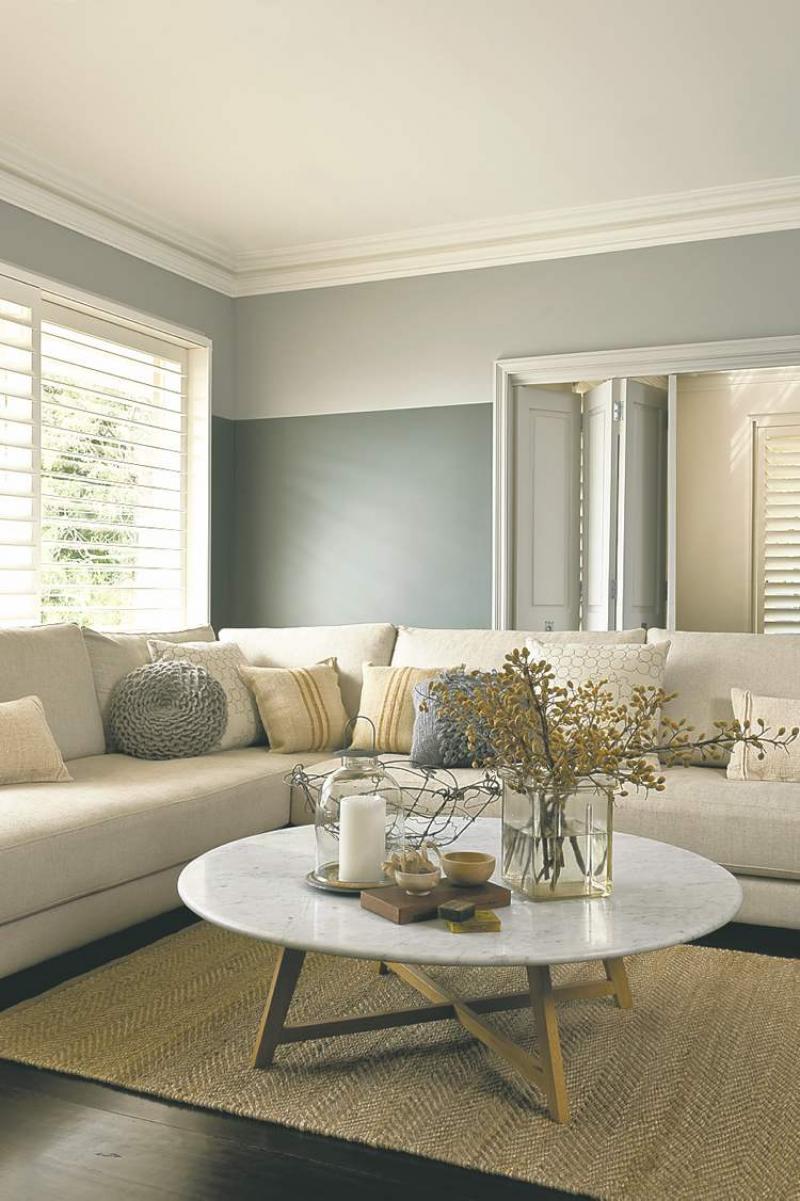
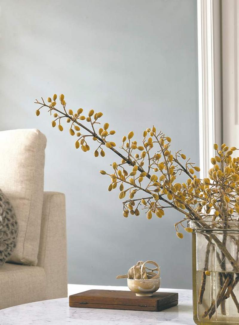
This stylish living room, photo courtesy of Dulux Paints, is serene and inviting. Shades of grey give the space a clean, contemporary appeal that is easy on the eyes and the psyche. This room immediately calms the nerves and provides of refuge from hectic daily life. Who wouldn't want to come home to that after a busy day?
Grey is often overlooked as a choice for wall colour. It is a popular choice in commercial design but underutilized in the residential arena. One reason people shy away from this colour is it is assumed grey will make the room dour or clinical. Another reason grey is bypassed is, like most paint colours, it is available in so many shades it can be difficult to choose the right one for the intended room. Both of these concerns are valid in some respect. Grey can be less forgiving than other colours, so choosing the right shade is important. The added effort required for this particular paint colour can be well worth it in the end as demonstrated in our feature photograph.
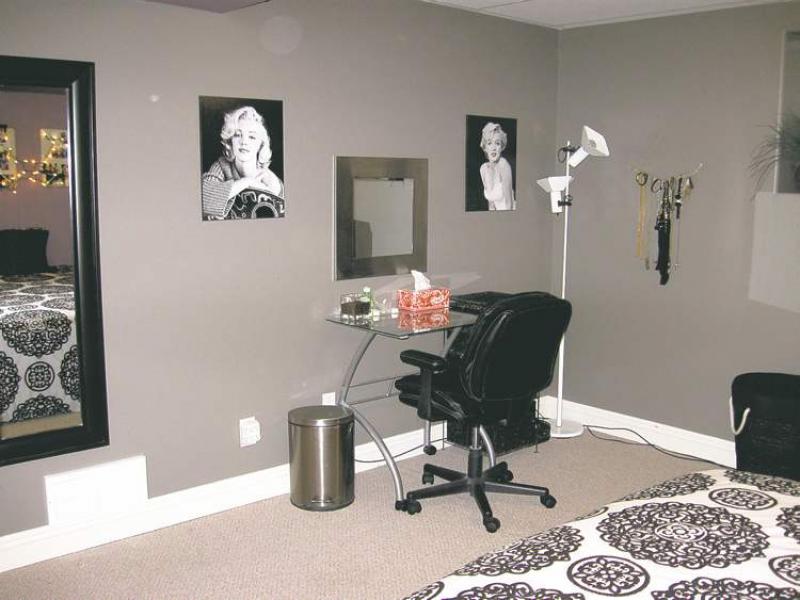
I had an email query from a reader a few weeks back about this very issue. Her teenage daughter wanted to repaint her bedroom in shades of grey and dark purple. This is a great combination but I had some questions to ask before I could give any sage advice. If you are considering using grey in your décor, your answers to these very questions may help you make the right choice.
Room size
Is the room in question large and expansive with lots of big windows and natural light? (As is the case in our feature photograph.) Or, is it a small, basement bedroom? Larger rooms with lots of visual 'breaks' (windows, trim, doorways) can take a darker tone of grey and even as dark as charcoal. A small room with diminutive architectural features and small windows might be better suited to a softer, light to medium shade of grey.
Lighting
Darker colours, and with grey that can be even a medium tone, need a room with good lighting. Grey is not a reflective colour so it will tend to 'absorb' light, which can make a room feel dark and gloomy if there is insufficient lighting. Lots of natural light during the day and good regular lighting at night is a must. If a standard bedroom has just one ceiling fixture and a couple of bedside table lamps, a light to medium grey is a better choice than a dark hue, for example.
Furniture
The furniture in our feature room is light and airy in appearance. Although the sectional sofa and coffee table are large, the light colours keep them from looking obtrusive and work well with the main grey wall colour, which is quite dark. If you are working with black leather furniture on the other hand, you may want to err on the side of caution by opting for a light to medium tone wall colour.
Flooring
Floor colour can make a difference in how the wall colour will appear. Firstly, establish whether you think the current flooring is cool or warm if you can. Wood flooring would be warm, in shades of brown, golds and reds, while grey carpet or tile may be cool depending upon the shade. Once you've made this determination, stay on the same side with the wall colour. Taupe or green-greys are warm while blue-greys are cool.
In general, green-based greys are the most forgiving and tend to appear neutral. Blue-based greys are in the cool spectrum but can be warmed up with wood accents in furnishings and accessories. Purple-based greys are tricky but lovely if you can find the perfect shade.
In the end, after making the above determinations with the homeowner, I suggested using a lighter grey than her daughter had initially chosen from a paint chip. This was due to the fact the room did not have huge windows with lots of natural light nor did it have lots of regular lighting to use during the evening. As well, the furniture was going to be mostly black. The room did have great wide baseboards and white panel closet doors, which would help a medium tone grey pop. You can see from their photograph that the room turned out quite nicely.
Other ways to make it work
As you can see in our feature photograph, the walls were treated with two shades of grey. The upper portion of the wall has a light grey set against a deeper tone on the rest of the wall. This paint technique offers a few positive traits. Firstly, it balances the darker grey and secondly it reflects more of the natural light, keeping the room bright and airy. By default, it also makes the room feel taller, which keeps the space visually open. So, if you're daunted by the thought of using a dark shade of grey, or any dark colour for that matter, you can always use it in smaller doses through various paint techniques like this one. Another effective treatment to consider is to use three shades of said colour in variegated shades and paint wide, horizontal bands around the room; dark on the bottom third, then medium then light on the upper portion of the walls. Horizontal bands will widen a room while the dark-to-light trio of colour will add height and light to the space. You'll still have fantastic, rich colour and subtle pattern but won't be overwhelmed by one solid dark wall colour.
Depending upon the main wall colour, grey can be accented with anything from hot pink, citrus yellow and orange to purple and red. So changing or updating the look is as easy as switching out accessories from time to time.
Grey is the new brown so give it some consideration if you're looking at repainting your décor. It's a classic colour that adds richness and depth.
connieoliver@shaw.ca