We've covered the basic psychology of the three primary colours over the past few weeks. Today, we're going to look at the secondary colours and their role in our lives and homes. These are the colours that give the décor personality and visual motion. Let's look at secondary colours and their respective traits.
Purple
A popular colour today, purple is a colour that comes from mixing red and blue. It balances the stimulation of red with the calming effects of blue to a harmonious end. Because of its relationship to royalty, purple can connote luxury, wealth and sophistication. Purple is uplifting, calming (often used in spas), encourages creativity and for some, offers a sense of spirituality.
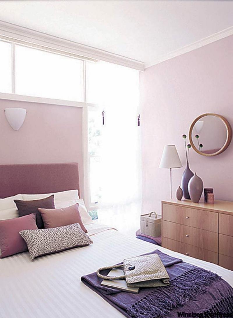
Soft violet is a great colour to create a calming and relaxing setting in a bedroom. This shade of purple is soft and romantic and mystical. It invites inner contemplation and meditation.
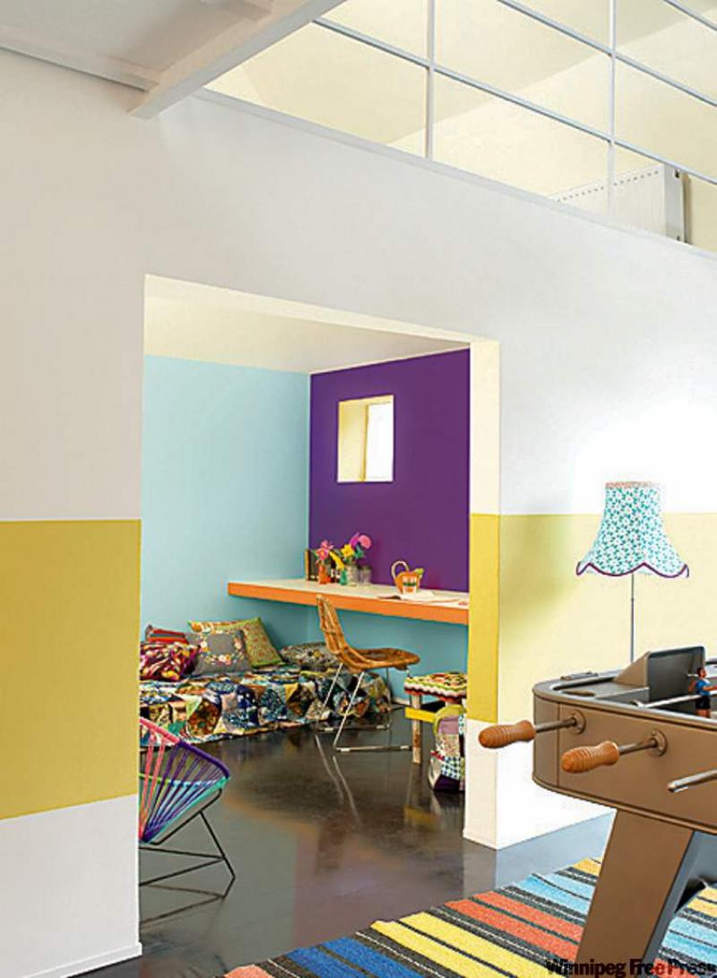
Darker shades of purple are grounding and comforting. Used as an accent colour on a wall or in bedding, dark purple can be very striking. Balance it with varying shades of lighter purple and pink for a lovely monochromatic palette. Dark purple can also be accented with yellow and red in small doses and can be balanced with soft white or cream colours.
Green
Green represents earth and life. Like blue, it is calming and refreshing. Mixing sunny yellow and serene blue results in a colour balance that is refreshing green. Green is a popular colour choice for the home. It's a colour that is widely found in nature so we are accustomed to it. Green shades range from a soft celery green to the darker forest and olive green so there is a perfect green for just about every décor style and taste.
Green works well with blue, yellow, white, black, purple and even orange. My own kitchen is a mix of asparagus green, navy and white. It's a lovely combination for the kitchen but in different hues can work in just about any room. Pale blue-green (sea foam green as it's been called) in the bathroom sets a refreshing backdrop to mauve and blue accessories. In the bedroom, a deep olive green balanced with shades of cream and rust can make for a cosy, earthy space. The current trend is more toward the pale shades of green, which are muted and visually refreshing.
Orange
Orange is another love-it-or-hate-it colour, however, used in small doses it can give a room that final wow factor it may have otherwise been lacking. Like red, orange catches the eye so it's a good strategic colour to use when balancing your décor. Orange is seen as a mostly cheerful colour, being the result of mixing sunny yellow and lively red. It radiates warmth and energy but it can be agitating when used in large spaces. I once visited an open house where a south-facing bedroom was painted bright orange and it nearly blew out my retinas! You'd have to wear sunglasses to be able to stay in a room like that for more than a few minutes. On a more positive side of this vibrant colour, a client of mine painted the living room of her Victorian home in a burnt pumpkin orange and it was stunning set against original white trim and wainscoting. In the right setting and hue this colour can be quite spectacular.
Earth tones
Earth tones are comforting and grounding. In nature the forest floor, mountains, tree trunks and so on are all in shades of brown so the earth tones are very representative of security and safety. These colours have a stability about them that is subconsciously appealing.
In the décor
Brown, taupe and tan colours are created by mixing three or more colours to get the desired shade. Because they stem from a number of colours, they co-ordinate with just about every décor colour, depending upon the hue or shade being used. Because they complement most décor colours earth tones are often used in permanent items such as flooring, countertops and cabinets.
Earth tones can also be dynamic on the walls. Creamy coffee tones provide a neutral but stylish backdrop to dazzling artwork and accessories. These light to medium tones unify the décor and give it a good base for everything else in the room. Darker brown can be enveloping and restful in a bedroom or den. When using these darker tones on the walls be sure they are balanced with substantial trim and moulding in lighter tones or light furniture and accessories. Good lighting is also important to keep the room looking elegant and not like a cave.
Aside from black and white we've covered most of the colour bases in the past few weeks. Hopefully, this has given you some insight into what road to take when choosing and harmonizing colours for your home.
connieoliver@shaw.ca