A lacklustre room can be dramatically improved simply through the use of eye-catching contrast. When there are no outstanding features to work with, you have to create your own drama. Just think about a black and white tiled floor, for instance. You can envision how the extreme contrast between black and white used in a pattern can quickly catch your eye and change the entire feel of a room.
Creating visual verve through the use of contrast is effective and doable. It can be done on a large scale or small, depending upon your tastes and budget. Using contrast on a varying scale can work wonders to boost your décor. You can create large expanses of contrast through the use of wall and floor colour, and you can use contrast on a smaller scale through accessories and accent furniture.
Bold contrast
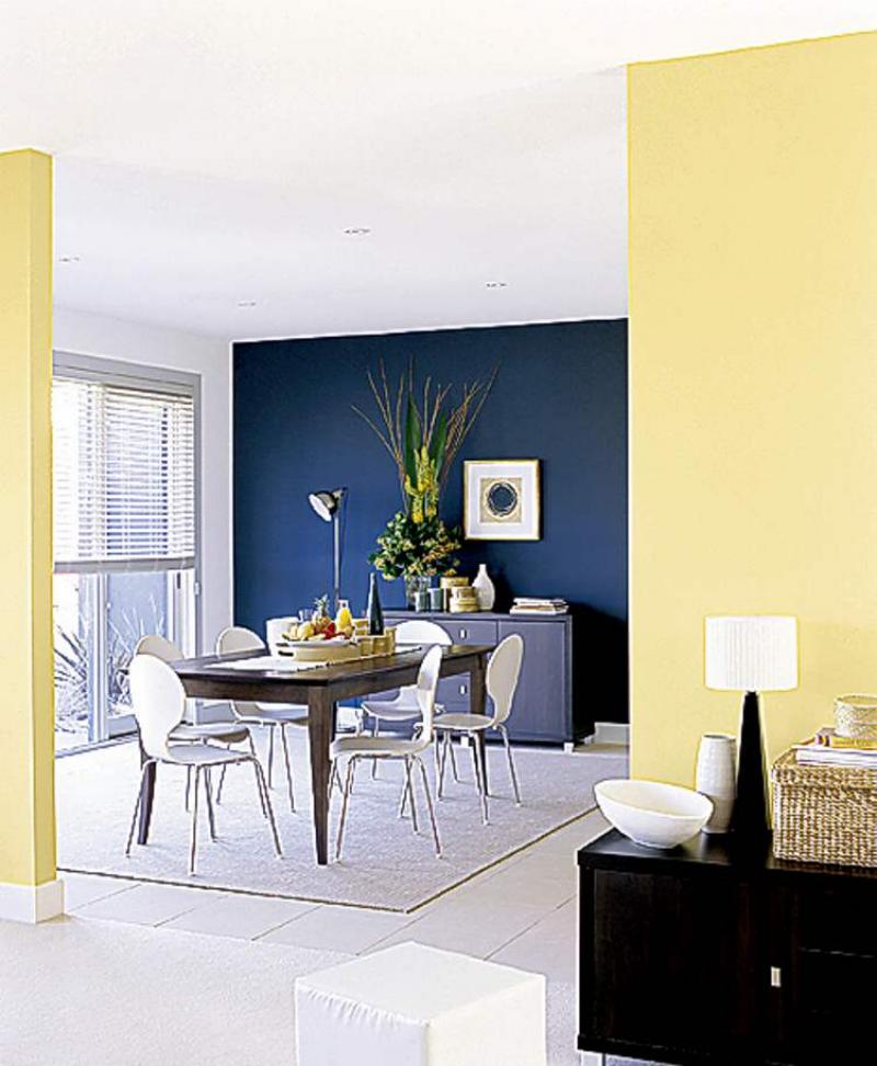
Our feature room has no distinguishable features, save for the large window, but it still has tons of personality. By simply adding the right paint colours the room takes on a whole new look. The bold blue feature wall stands out in contrast to the coordinating sunny yellow walls and white flooring.
The feature wall really sets the tone for the entire space. The dark contrast of the blue feature wall immediately captures your eye, which is what a focal wall is supposed to do. It also delineates the dining area from the rest of the open space.
Bold on a smaller scale
Further contrast is infused through the choice of white dining chairs, versus say, dark, wooden ones. The white chairs not only pop in front of the dark blue wall but they also lighten up what could have been a dark dining set, if the chairs matched the dark table. By the same token, the dark cabinet and black lamp base in the foreground are in strong contrast to the soft yellow wall.
The mix of soft white, yellow and wicker accessories create drama on yet a smaller scale.
You can see how the contrast changes from strong to soft through the white ceramic vase on the focal wall cabinet versus the white lamp shade and accents on the cabinet in the foreground.
The framed print and large flower arrangement give the dark wall movement through contrast and texture. Note how the height of the arrangement adds drama. Go big!
Subtle contrast
Even subtle contrast can make a design statement. The off-white area rug on the white tile floor provides slight contrast as do the wicker accessories set against the yellow wall. Both choices are understated but effective.
Another example of subtle contrast is the placement of the dark buffet cabinet against the focal wall. Though the cabinet is fairly large, your eye barely notices it set against a dark wall.
Knowing that you have control over the strength of contrast will help you decide your placement of furniture and accessories depending upon your taste. For example, if you want your kitchen to be lively and cheerful, then use strong contrasting patterns to get the look you desire.
Cheerful patterned linens and window treatments, wallpaper and so forth can be used individually or in harmony to create the look you desire. On the other hand, if the master bedroom needs to be serene, a more monochromatic palette is warranted.
A word of caution
Too much bold contrast can be unnerving in some situations. Just to make a strong point, the two contrasting colours in our feature room are lovely, but if you used checked wallpaper in yellow and blue on the focal wall instead, it would probably drive you nuts after an hour or so. Large sweeping expanses of bold contrast are easier on the eyes than large expanses of busy pattern.
Use bold contrasting pattern in small doses, such as toss pillows or curtains. Patterns with subtle contrast can be used in larger doses.
Work with what you have
The handy thing about contrast is that it can help you camouflage items that you don't necessarily want to stand out.
If you can't afford new furniture and the pieces you have aren't in the best shape, you can make them less noticeable by painting the wall behind them in a colour similar to the sofa fabric (like the buffet set against the blue wall in our feature photo). If you have light coloured items that are lacklustre, use strong contrasting wall colour and accessories to breathe new life into the room.
Play with contrast to see how you can update your decor. It may turn out to be easier than you think.
connieoliver@shaw.ca