Sico's colour forecast for the next 24 months encompasses a new twist on soft pastels and warm neutrals.
Colours with names like Wild Mushrooms or Virgin Olive Oil set a neutral base for the more vibrant medium tones that are also part of the new colour forecast. Stronger tones of the more demure pastels are found in colours like Valentine Card (a strong red) and Blue Neon to add some pop to the mix. Deep purples, mustard, pink and something akin to a Kelly green are focal colours in the new colour forecasts that are vibrant and fun.
These colours have strong personalities, so there is something for every decor taste. Even though some pastels have made their way back into the new palette you won't find powder blue chiffon curtains in the projected future decor. You will see strong colour on focal walls with unusual accent colours that really work.
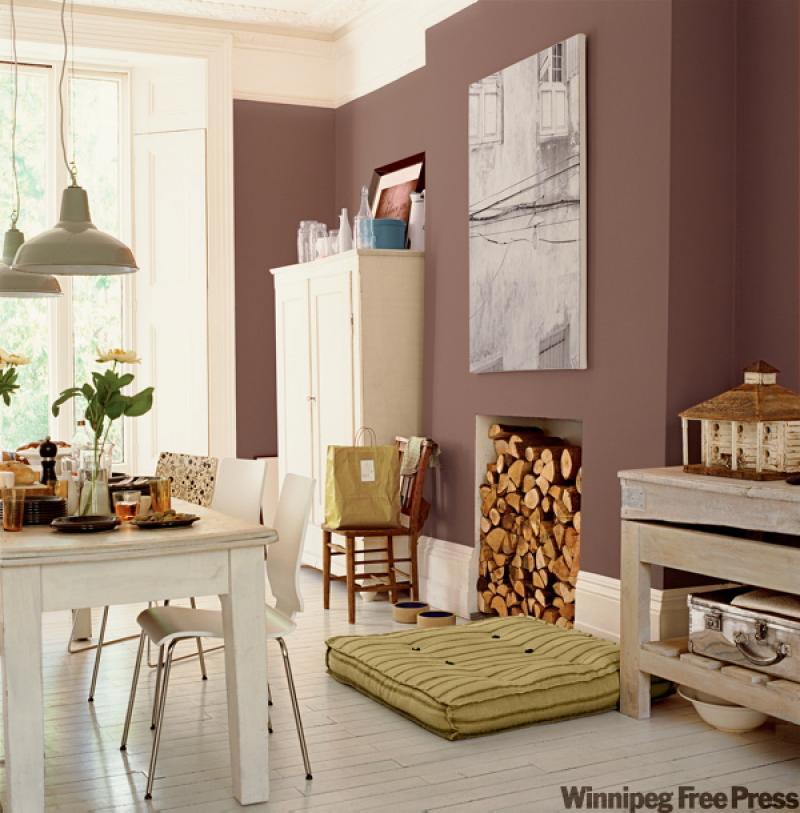
The new colours are juxtaposing contemporary and even modern interiors for a combination that's rejuvenating and inspiring. They also work in casual settings like the casual dining room in our feature photograph, courtesy of Sico Paints.
Most of us would probably choose a safe colour for a room like this. Butter yellow, sage green, maybe even a light grey would be fine choices; but you can see how much more interesting a strong colour choice can be. Rich wall colour can make accessories and furnishings pop. As I've said before, strong wall colour needs some sort of frame in order to look great. Wide baseboards and ceiling molding make this colour scrumptious. The off-white furnishings and painted wooden floor keep the room from feeling gloomy.
Fool the eye
If you don't have such lovely architectural details in your space but want to use a rich wall colour, there are ways to trick the eye and have a look similar to this room. This first idea works best in a room with ceilings that are nine feet or higher. End the rich wall colour one foot below the ceiling, which will leave a band of white or off-white colour around the room mimicking a wide band of ceiling molding. You can leave it like that or use decorative wooden trim in white to separate the two colours.
You can also enhance the look of narrow baseboards by adding half-round trim about two to three inches above the baseboard and painting the entire space in the white or off-white. You could also do the opposite as I did in my kitchen. Leave the walls white and put a band of rich colour twelve to fourteen inches from the ceiling around the entire room.
Much of the new colour palette from Sico is not for those who are timid with colour. I hope that doesn't dissuade you from taking a leap of faith with some vibrant colour in your home. You can use smaller doses of the more vivid colours in other ways that might work for you.
For example, in our feature photograph, instead of using one solid colour you could use wide bands of graduated strengths of one colour. A wide dark horizontal band of purple at the bottom of the wall, followed by a lighter version higher up on the wall and so on until you have filled in the wall. This treatment can make a room look wider and taller, so if you're in a small space, consider fooling the eye with paint treatments.
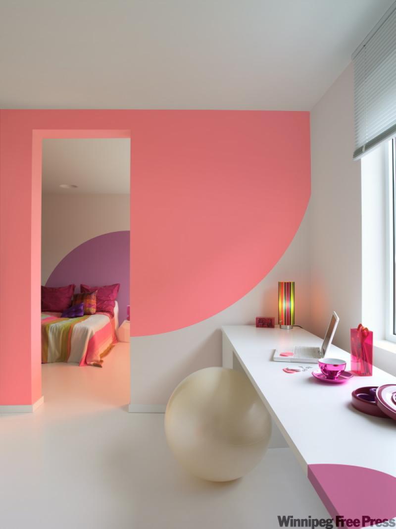
Other ways to incorporate vibrant colour in smaller doses is to paint geometrical patterns on light walls using splashes of vibrant colour.
For example, one of Sico's new colours is a bubble-gum pink called Ningixa Pink. This colour would be fun for a little girl's room. However, painting the entire room in this bright colour might be too much colour for one room.
Use the bright pink paint to create a colourful focal point above the bed. A large semi-circle behind the bed might act as a visual headboard, just as one example. A large pink letter of the child's first name or a simple pattern like a butterfly could work as well. Perhaps a soft pastel pink on the walls and this vibrant pink on the doors and trim would work for you. A quart of paint is probably all you'd need to add some sparkle to a any room using a splash of bright colour.
For us adults, the unfettered use of vivid colour is refreshing and unexpected. Colours like Blue Neon, which looks like the name sounds, would be a lovely colour in a tropical bathroom or as a backsplash accent colour in the kitchen. The more neutral earthy colours like Virgin Olive Oil or Pomelo, which are along the mustard tones, would be gorgeous in a living room, den or bedroom.
Soft grey and light pink are an unexpected duo but are both masculine and feminine. If you and your spouse can't decide, you might both get what you want with a colour duo like this.
The colour forecast looks as if it will reach just about every possible taste and home out there. Whether it's a tranquil decor of soft pastels, a rich early space great for relaxing or a young, vibrant loft that is bold and dynamic there is something for everyone in the new colours that will be out soon.
Start planning in the New Year for next spring's grand transformations. It will give you something to do over the winter and something to look forward to in the spring.
Connieoliver@shaw.ca