You should be seeing red
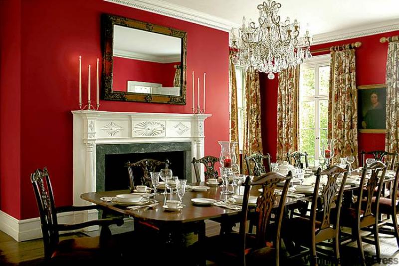
Red is a colour most people love when they see it in decor photos, but they are afraid to actually use in their own homes. Take this elegant formal dining room photo, for example. This room is lovely to look at, but could you actually take that colour plunge?
Using red in the decor, especially on walls, makes a bold statement and not everyone is up to the attention a room like that can bring about. It's understandable why many folks stick to a more palatable colour palette. If you're one in the minority who really want to take your decor to the next level but you need a bit of a push, read on.
Our feature dining room photo, courtesy of Pratt and Lambert Paints, has all of the bells and whistles that make it an elegant, formal space. Lots of trim, windows, a fireplace and high ceilings all work together to a gorgeous outcome. Most of us don't have such grand dining spaces, but that shouldn't stop you from making a decor statement, though it does help to have contrasting elements, like white trim, to help break up this strong wall colour.
Psychology of the colour red
Red is the most emotionally intense colour. It represents passion and love, anger and urgency. Red stimulates appetite and is therefore a good choice for the dining room. This colour makes you feel warm and can raise heart rate and respiration.
Where to use red
Because of the strong emotional and physiological response to this bold colour, it may be best used in rooms where you aren't spending hours at a time in one sitting. The dining room is the perfect area to try a bold colour like red because it will induce conversation, appetite and ideas. This is why red is a popular colour in restaurants. On the other hand, red might not be the best choice for a bedroom or a child's room where you want a sense of relaxation and tranquility. A red kitchen can be stunning as long as you counter the colour with light or white cabinetry and good lighting. In small doses, red can be used in any room, so don't discard it altogether by any means when planning your colour palette.
Use red in smaller doses
While all of the walls in our feature room have been painted red, you don't necessarily have to follow suit. In a smaller, less formal dining space you could paint just the focal wall red. Use a co-ordinating colour on the secondary walls that will compliment and support the strong focal colour. A pastel yellow secondary wall might not cut it, for instance. A rich golden yellow, however, could be spectacular.
By painting only the focal wall in red, you are using the technique of colour blocking. This practice will give you the splash of vibrant colour you want but won't overwhelm the room or the senses. This technique can work in many situations. For example, you could have a red focal wall at the head of the bed because you won't see it when you're sleeping so it won't disturb your rest. It will, however, give the bedroom huge personality.
If you go all out
If you do want to go all out and use red on several walls, as in our photo, then you need to break it up with contrasting trim, artwork and window treatments. This way, it is viewed by the eye in smaller doses but still maintains tons of visual appeal.
Still have doubts?
If you aren't ready to take the plunge by painting any or all walls in red, or perhaps you're renting, you can add a large splash of red to your decor by purchasing an oversized canvas and painting it in your favourite shade(s) of red or stretch red fabric over the canvas and hang it on a focal wall. It will still have impact but in a much less permanent way. Throw in a few red accessories around the room to keep a visual flow to the space.
Which shade of red will work?
This is the toughest part of any paint colour decision. When using red, it's even more daunting. A lot depends on elements of the room, lighting, furniture colours and personal choice. The best way to be sure is to paint one large section of a wall (in the required number of coats) and see how it pans out. It's worth the few extra dollars and time to ensure you have a smashing red to suit your home. Unless you are going for a 1950s diner decor, you should choose a matte or eggshell finish on whichever shade of red you choose. A matte finish will ensure an elegant look.
If the colour red speaks to you, then you should answer it in the positive. What have you got to lose? It's only paint after all.
connieoliver@shaw.ca