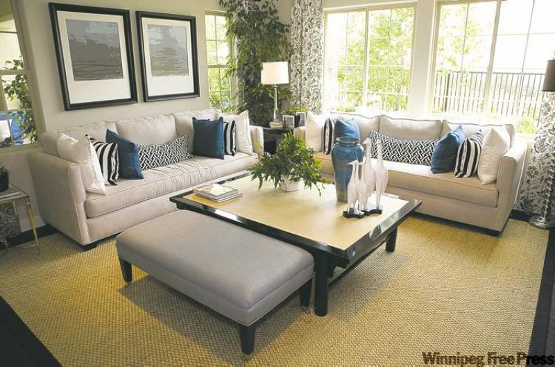
Our feature photograph, courtesy of CIL Paints, is all about a room with clean lines and symmetry that still maintains a sense of warmth and comfort. You wouldn't think a room with straight lines and a strong geometric base would be cosy or inviting. I thought this was a good opportunity to see just which elements in this room speak to both sides of that design coin.
This room is filled with crisp, straight lines and a repetitive pattern of squares. The room itself has large square windows with mullions, which add yet more squares to the space. Even the partial wall on the left, between the two windows, has a basic square shape. Furthering this facet is a square area rug (with a dark border that strengthens the shape visually), a square coffee table (again with a strong contrasting border) and two large square prints over the sofa. The frames on the prints are without any carving or detail, which furthers the clean look. (Note how the coffee-table colours and shape mimic the area rug... nice touch.)
The furniture has clean lines. There is no skirting on any of the pieces, no tufted design and no pattern in the upholstery. The sofa seat cushions are tailored, neat and trim as is the ottoman. The sofa arms are also slim and tailored and the linen upholstery is reminiscent of a linen suit.
Soft touches
With all of these sharp angles and lack of detailing, one would think this room would be stiff and uncomfortable. It could be rather stark if the room didn't include a few soft touches, which are what we're going to scrutinize today.
The microfibre fabric on the sofa, while sans pattern, is soft to the touch, which makes it inviting. The overstuffed back cushions on both pieces definitely soften the look and strengthen the comfort factor of the two sofas. Adding to the cosy appeal are the multiple toss cushions, which beckon you to snuggle in and get comfy. (Note that while the sofa cushions add softness, they are still all square (and rectangle) and are placed symmetrically in keeping with the clean lines.) The fun patterns and colour of the cushions help give the room a casual tone, which balances nicely with the hard lines in the room.
The casual weave and slight texture of the area rug emits a casual summer feel. The subtle pattern in the drapery panels adds to the softer side of this room. They soften the harsh edges of the large window, as well, more so than say, Californian shutters would.
The accessories on the coffee table have soft, wavy lines, which again, balance nicely with the square coffee table. The houseplants add pattern and bring the outdoors in, which compliment the view from the large windows. The side table, positioned between the two sofas, is round versus square. Less obvious, but still effective, are the round lamp shades (versus square ones) and the unique design of the floor lamp to the right. Opting for a few choice accessories over a table full of little ones is definitely a better choice for this space and may be for your own.
People who are attracted to this particular look prefer order over clutter but also want an inviting, casual space. Style and comfort can coexist nicely if you attain the right balance.
Calling all men
On a totally different note, CIL Paints is inviting men to help them create new names for their paint colours. The company is betting that giving paint names a masculine label will get men more excited about the painting process.
"Studies show that while a larger percentage of women tend to choose paint colours for their home, it's often men who give the colours a final nod and then go on to spearhead the project," says Alison Goldman, marketing communications manager for CIL. "In an effort to get men more enthusiastic about painting projects, CIL is launching a campaign to involve them from the get-go."
All participants need to do is submit their suggestions on CIL's Facebook page and get the most votes from the public. The paint names that garner the most votes will be compiled into a special brochure alongside CIL's existing display of more than 1,200 colours. What's more, the most popular selection will yield the winner a $10,000 home theatre makeover powered by Klipsch.
"The bottom line is that choosing paint colours isn't black and white," says Goldman. "When it comes to paint names, it's all about the emotional connection and our research shows men and women tend to relate to paint names differently."
To participate in the campaign -- which runs until Sept. 30 -- visit CIL on Facebook or www.cil.ca for more details. To watch a video of men's responses to different paint colour names, go to YouTube and key in "Paint Chip Names for Men."
So men, put your creative thinking caps on. You may just be painting your walls a colour called Beer instead of Butterscotch or Blue Jeans instead of periwinkle blue in future.
connieoliver@shaw.ca