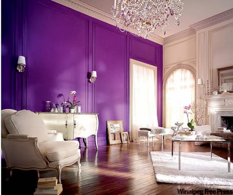
You certainly can't call our feature room average. The bright purple wall on the left (from Sico's Cashmere line in Macedonian Mauve) is a refreshing change from the ordinary. When you see spaces that push the envelope a bit it opens up a whole new avenue for décor inspiration.
This room is whimsical, full of energy and at the same time elegant. Though sparsely furnished, the space still offers tons of visual delight. The vivid wall colour takes center stage, which in this case is warranted.
Soft cream-coloured French Provincial furniture adds to the regal atmosphere, which is fitting since purple is often associated with royalty. The exquisite chandelier definitely works and has purple crystals that help carry the purple throughout the space.
To tone down the visual contrast, the entire wall, including the trimmed wall panels, was painted purple. This is a good tip to keep in mind when using strong colour.
In most cases you do need some contrast, like painting ceiling and window trim and/or baseboards in a white or cream colour, but in this case, painting all of the trim in contrast would have been visual overload. Using this technique can help minimize unsightly wall variances like vents or a door chime. Don't use this technique to paint smoke detectors though as it can inhibit their effectiveness.
This room gave me an "I never would have thought of that" moment which was exciting and inspiring.
I don't suspect that many of you will try to copy this particular room in your own home, but just seeing what can be done allows your creative side to stretch a little outside of the box, which is always a good thing.
Our feature room is grand, with high ceilings and large windows that help provide the elements needed when using a strong wall colour.
Most of us don't have such large rooms to work with but that doesn't mean we can't have enchanting spaces. In a more realistic situation I can see a wall colour like this being used as a focal colour at the head of the bed (by painting the entire wall or just a band of vertical colour) or used in a colour blocking situation, like painting large geometric designs in a child's room.
A colour like this can help set off a white fireplace that needs a little visual pop.
When choosing which vivid colour you want to use, there are a few factors to keep in mind. If, for example, you want to paint the wall at the head of your bed in a strong colour, keep in mind the colour of your headboard. As noted above, the furniture in our feature room is a soft cream colour which compliments the strong purple wall.
If your headboard is dark brown rather than white or cream, it might appear muddy against a colour like this purple so you might want to do a little online research to see what colour would work.
Paint manufacturers' websites offer tons of fun tools to help you with your colour choices. Or, if the headboard needs an update, you can always paint it in a lighter colour. If you plan ahead you can save yourself a lot of grief.
You don't want to choose a colour then have to paint your furniture because the palette isn't working.
Other things to keep in mind are your current carpet and flooring colours, door and trim colours and lighting. They all play a factor in the mix, and you want to work with what you have rather than working against it and having a frustrating outcome.
When using strong colour the quality of paint can make a difference. Better paints have more depth which makes the colour rich and luxurious. Higher quality paints also provide better coverage which means fewer coats of paint and less work.
Sico's Cashmere line is unique in that its finish brings richness and depth to wall colour, which is part of why this vivid purple colour works so well.
It is also a paint and primer in one, which cuts down on prep time. When you're going for it with a daring wall colour the quality of paint can make a huge difference so it's worth the investment if you want a designer look.
connieoliver@shaw.ca