Courtesy of PPG Paints
The Heartland Collection, a new series of paint colours from PPG Paints, aims to bring the look and feel of regions throughout the country into your home.
Last year, my husband and I took a road trip to the East Coast. As lovely as it was and as breathtaking as the scenery was, I still found myself yearning for the beauty of Manitoba’s prairie landscape. There’s nothing like a Prairie sunset to take your breath away. The vastness of the Prairies gives one breathing room. Manitobans know the Prairies have a beauty all their own. Now others are realizing it as well.
For those who can’t get enough of Manitoba’s breathtaking landscape, a leading paint brand has come up with a way to recreate the feeling of the province’s spectacular scenery indoors.
The PPG Paints brand recently launched the Heartland Colour Collection, a palette of 40 colours that represent six themes: Summer in the Prairies, Harvest in the Sunset Country, Classic Colours of the Lake Country, Urban Vibes in the Canadian Shield, Coming Home to Northern Neutrals, and People and Tradition.
Available exclusively at McMunn & Yates Building Supplies stores, the collection brings the look and feel of the region’s outdoors into home decor. Think warm combinations of golden wheat, moss green and misty grey; crisp coral, punch red and rich brown; sky blue, dusty pink, wood brown and taupe; and muted gold, green and silver.
"The Heartland Colour Collection is inspired by the outdoor lifestyle, stunning geography and vivid colours of Central Canada’s diverse landscape," said Dee Schlotter, brand manager, Voice of Colour program of the PPG Paints brand. "With a spectrum of vibrant and neutral colour combinations, it captures the varied backdrops of the Manitoba region, from the soft neutrals of the Prairies, to the bold hues of traditional and urban cultures, to the tranquil, saturated tones of cottage life and spectacular shades of the changing skyscape."
The colours for the collection were selected by PPG’s experts in conjunction with McMunn & Yates Building Supplies. M&Y then reached out to customers and asked them to suggest names for each shade through an in-store contest.
Several of the suggested names have been incorporated into the collection, including Snowy Owl, Moss Trail, Golden Oat Field, Canadian Forest, Wonderous Wheat, Hippie Blue, and Rich Earth.
People are increasingly looking to nature for inspiration in choosing colours for their walls, furniture and overall home decor. Manitoba’s colourscapes of golds, blues, greens, greys and reds, coupled with its sprawling grassland, lakes, rivers, mountains, forests and majestic sweeping views, create a landscape like no other and serve as the basis for the new Heartland colour palette.
Our region has a rich history that is very much tied to the land from our early trading days and farming. The goal is to bring the history, beauty, lifestyle and multicultural heritage of this magnificent part of Canada to life through colour with a new, exciting, and exclusive palette.
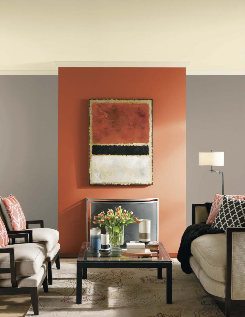
Our feature photograph reminds me of a fall harvest of pumpkins and the steely grey of the Canadian Shield. This combination is warm and comforting and could work in any room. Using the vivid orange (Rum Punch PPG1190-7) on the fireplace focal wall is a great way to add a splash of colour without being visually overwhelmed.
As well, carrying this colour to the ceiling provides visual height and drama. The grey (Eiffel Tower PPG1022-5) is a trendy neutral that is popular in today’s decor. The accents of black on the furniture and even in the painting over the fireplace add a contemporary flavour and make all of the colours more vivid. Even the ceiling has a soft wheat colour on it (Snow Dawn, PPG1021-1).
The colours in this collection are definitely palatable and inviting to most any style of decor. Earthy neutrals are a great base for punches of vibrant prairie colours found in wildflowers, pumpkins or sunsets. This new colour collection is definitely worth consideration.
I think it’s great Manitoba’s landscape is being celebrated through colour. It’s about time it got some recognition for the beauty and drama that is the Canadian Prairies.
Bringing this earthy colour palette into your decor is a great way to bring the outside in and to celebrate our surrounding landscape. Check out the new paint colours and infuse your home with prairie beauty.
Connieoliver2016@gmail.com