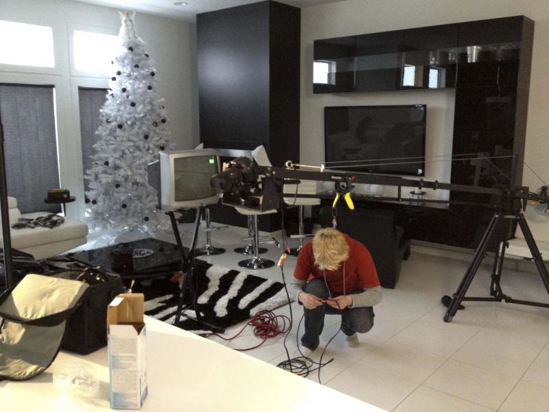
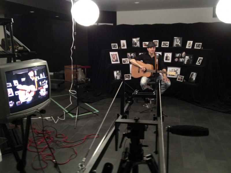
Cinematographer Paul Blair MacLean prepares the camera for a scene for the One Foot Out The Door video shoot, setup on main floor of Ryan’s home (note the black and white theme)
Marc LaBossiere / Winnipeg Free Press
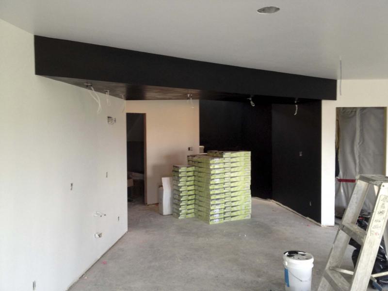
Base of the stairs, angled mini-utility room and ceiling boxing visible in black, boxes of laminate waiting to be installed
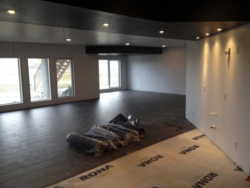
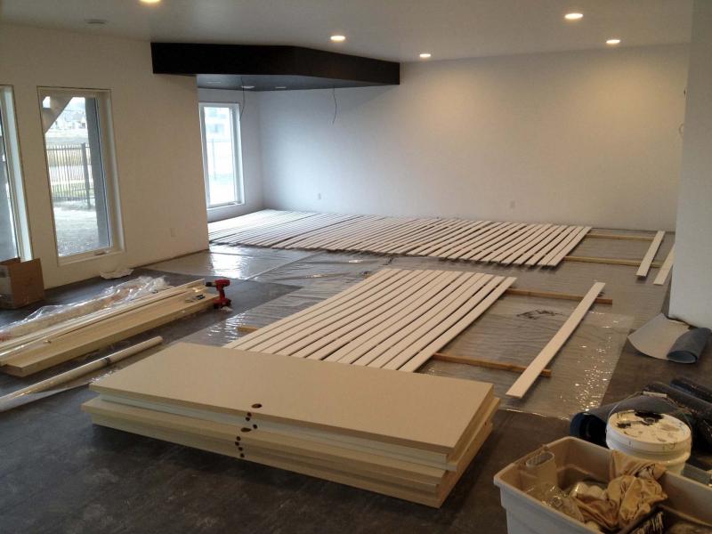
rec-room space, far corner protrusion ceiling boxing visible in black, laminate partially installed
Marc LaBossiere / Winnipeg Free Press
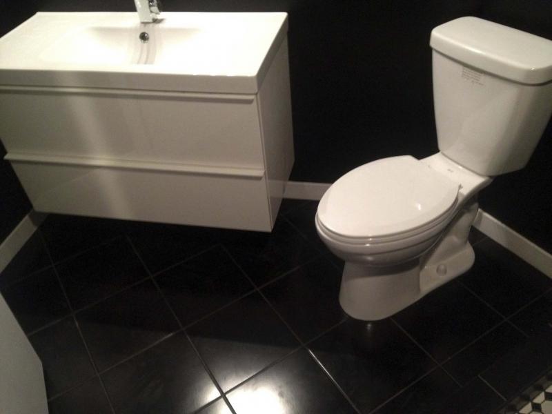
Bathroom walls and floor tiles in black, vanity/sink and toilet in white contrast
Marc LaBossiere / Winnipeg Free Press
Marc LaBossiere on the set of the music video for his song One Foot Out The Door, which was partially filmed in the black and white lower level of a Sage Creek home he had previously renovated.
The term "black and white’" is most often utilized in a figurative context. Just like the term "cut and dry," it eludes to clarity, without any room for confusion or ambiguity. And although my client’s lower-level walk-out renovation tasks in Sage Creek were far from being "black and white," the project literally was... or so I would learn.
Sometime in early summer of 2013, Duane Ryan approached me with a rather large undertaking: after recently having purchased a new home with Diane Boutroucas, the couple wished to complete their lower level, which had been left unfinished after the house had been built. Ryan had seen photos posted on Facebook of my recent work and the recording studio I had built, and was interested in my handiwork. As always, I met with him on site and discussed the impending project in length. Following an extensive quoting process, the project finally got underway early that fall.
Other than the exterior walls and a few existing supporting walls, the entire lower space was basically an empty shell. Like an artist with a blank canvas, Ryan afforded me the opportunity to design a layout which best showcased the enormous space — nearly 1,800 square feet, which would be divided into a main rec room, a three-piece bathroom, two bedrooms and a utility room.
The existing ducting was exposed and needed to be boxed in. Due to a 45-degree angle on one of the main supporting walls, it was difficult to introduce framing elements throughout the entire space without incorporating angles in other locations. After reviewing the existing layout extensively, I came up with a plan that included a few additional angular features, to tie everything in.
For some reason, the electrical panel was not located in the utility room (likely due to where the hydro service came into the house) as expected. This presented the first challenge — no one wants an exposed electrical panel to be the first thing anyone sees when reaching the base of the stairs. And simply boxing it in would still render the isolated area an eyesore. My solution was simple: frame in the panel within a small closet or secondary utility area, whereby the walls are set at an angle that mirrors the existing supporting wall.
As unconventional as it may sound, it was the perfect way to lead anyone entering the space into the main area of the rec room. The angle of this newly introduced utility room discretely directs you away from the wall at the base of the stairs and into the main rec room.
The remaining angular elements are found in the ceiling boxing. The placement of the main-floor ducting for the ventilation system was exposed. And in those specific areas, there were only two options: frame them in using a minimalistic approach or create a ceiling design that not only strategically hides the ducting, but also enhances the aesthetics of the space. Obviously, we opted for the latter.
The three main areas of contention included the ceiling between the existing support wall and the newly constructed mini-utility room, the area above the walk-out doorway and the ceiling above the 10-by-six-foot protrusion in the lower-level footprint, at the far corner of the rec room. The first area between the supporting wall and small utility room I had introduced was rather easy to tackle. The main boxing simply closed in the parallel ducting from the angle of the support wall on the rec room side, and introduces an angle midway through the staircase side to mimic existing angles of both the support wall and utility room wall. The area above the walk-out door was boxed in to also mimic existing angles. It is the ceiling above the far corner protrusion that creates the coolest illusion. By extending the ceiling boxing outward and into the rec room space, using an angle on the close side to initiate the extension, that space appears to look larger than it is — your eye naturally carries the ceiling boundaries downward, towards the floor. The 10-by-six-foot area now feels more like a 10-by-10-foot secondary space within the large rec room.
Ryan’s entire main floor is decorated in black and white. It was no surprise to me, when it came time to choose colour patterns for the lower level once the drywall and taping stages were completed, that black and white would be the theme downstairs as well. As such, a durable 10mm as-close-to-black-and-white laminate was chosen for seamless floors throughout. Black and white paint were purchased for the walls and ceilings. Ryan and I discussed how to best choose which areas would be black and which areas white. The hallway heading to the bedrooms and the bedrooms themselves would be completely white, as well as the main utility room. It was the base of the stairs into the main rec room and the bathroom that were chosen to showcase the expected colour disparity.
The bathroom walls and floor tiles are black, to contrast the white of the vanity/sink and toilet. The shower stall was ordained with black wall tiles, and a black and white mosaic used for the shower base. The more difficult colour decisions were in the rec room area. The walls were very long, and black would optically diminish the size of the space. The wall leading from the main floor and down the stairwell was already black — luckily, this wall continued only until the edge of the newly-introduced angle of the mini-utility room. Once that colour choice was established, the rest was fairly straightforward: all rec room walls would remain white, as well as the main ceiling. The only other black features (other than the laminate flooring) would be the architectural boxing, which also highlights the angular features of the space.
Once the painting began, everything fell into place. With the casings and baseboards installed, my clients were then able to populate their lower level as they so wished.
This was the first "big" lower-level project with which I had been tasked. I am forever grateful to Duane and Diane for giving me that opportunity.
Roughly a year later, their home was chosen as the location for a music video shoot, a song I wrote called One Foot Out The Door. Things had come full-circle: the musician builds a recording studio, a client hires that musician (and now contractor) to build his lower level, then that musician’s music video is later filmed in the very space the musician created for the client — it’s one of my favourite renovation tales.
And, in case you may be wondering, the music video was NOT filmed in only black and white.
BossEnterprise@outlook.com