SINCE paint colour is as personal as it is powerful, Beauti-Tone recently asked Canadians to choose the brand’s 2016 colour of the year.
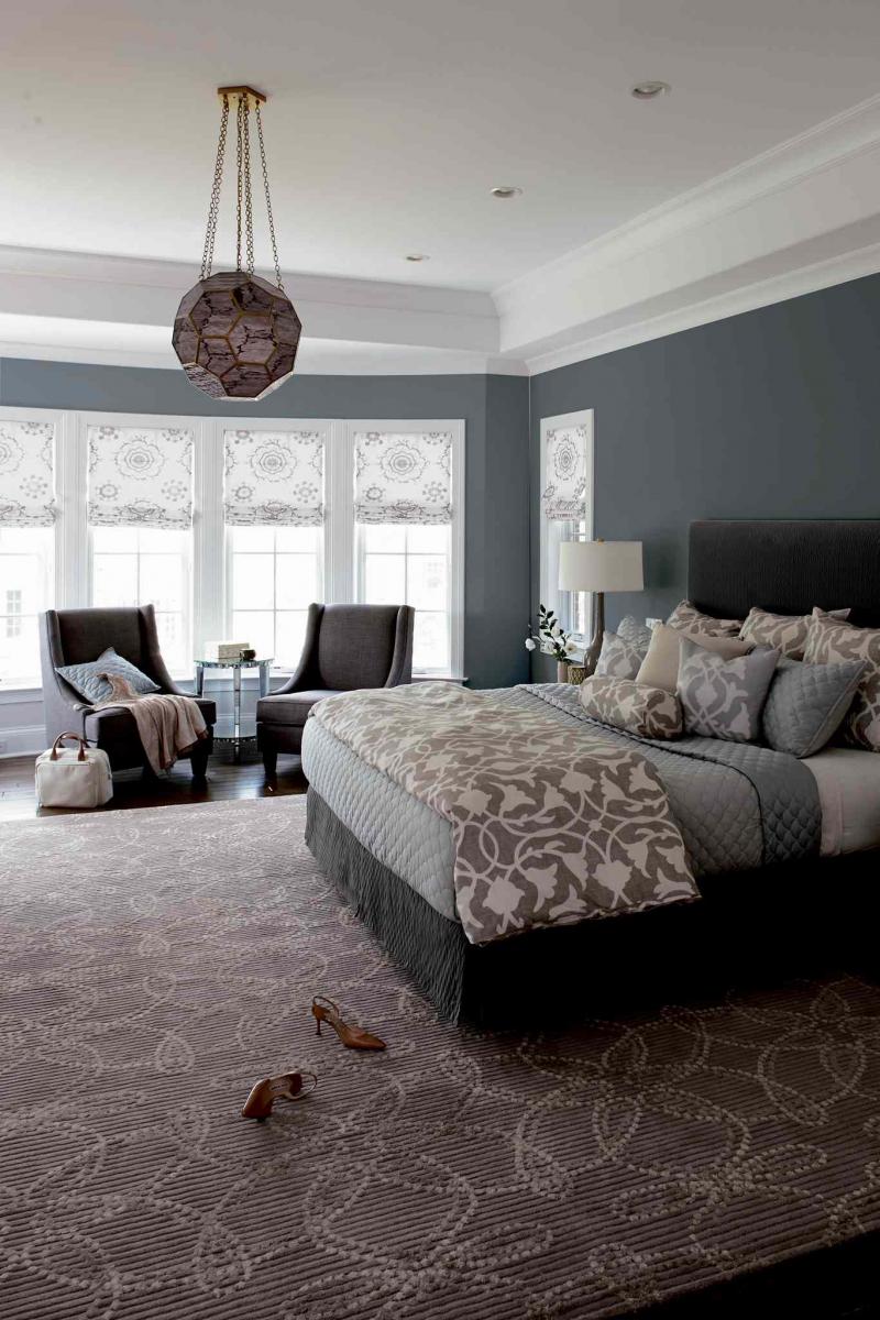
The winner, French Charming, is a cool blue reminiscent of a well-worn, comfortable pair of jeans. "French Charming is a great choice, it is a perfect balance of blue and grey, making it an incredibly livable colour for any room," said Beauti-Tone creative director Bev Bell.
Beauti-Tone, a division of Home Hardware Stores, announced the winner in January at the Interior Design Show in Toronto and online at Home Hardware’s Facebook and Twitter pages. "Canadians embrace great colour and style, and we know what we love," said Bell. When we walk into a room and feel immediately grounded, it is usually because the colour speaks to us, making us comfortable and relaxed. Bell was enthusiastic with the voting process: "All weekend we kept hearing how much everyone loved the concept of crowdsourcing the Beauti-Tone colour of the year."
Credit also goes to Canadian fashion designer and style king Simon Chang. The French Charming colour hails from his Beauti-Tone colour collection, which features seven unique palettes.
With these colours, Chan reminds us that although we may each have different tastes, we all want to feel rejuvenated and happy in our surroundings. He nailed it with French Charming — this colour manages to feel both modern and historic, and I can’t wait to try it out in my home.
You can see by our feature photo, this colour is stunning, especially when paired with white. The white ceiling and window trim really make it pop. Keep this in mind when choosing medium to dark wall colours. The contrast can be stunning. Because French Charming is a blue-grey hue, pulling either colour out in accents, as was done in our feature room, is a winning decor choice. The contemporary grey speaks to today’s trends, while the pale blue bedding offers a romantic hue from the past.
In other rooms, such as a living room or den, you could pop this wall colour with a dark charcoal or black furniture and accessories. A bit of black adds a little elegance and contrast to just about any room. Items like black floating wall shelves fit the bill. If you have black furniture and find it a bit overwhelming visually, soften it with muted colour furniture throws and toss cushions in a matching or coordinating colour to the walls.
French Charming would work well when accented with deep purple, muted pumpkin, bright violet, khaki green or brick red — meaning options for your colour palette may be endless. This is important because you don’t want to be stuck in a rut a year down the road and have your wall colour dictate the colour choices for your room. French Charming gives you colour palette options and room to change the look of your space on a whim.
Connieoliver2016@gmail.com