Matching sets can be boring. Why let someone else determine which accent chair goes with your sofa or that table lamps have to match. Coordinating items rather than playing it safe with matching sets is a great way to break out of the world of matchy matchy.
Using the art of coordinating versus matching items can also be a nice break for your décor budget. You may already have items that can be used to update your décor that you might otherwise overlook because they don't 'match'.
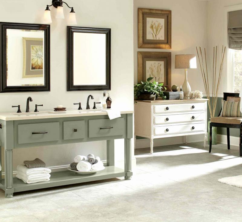
Today's feature photo has a few good examples of coordinating decor techniques that I thought worth review. The double vanity and dresser are the most obvious example. There are a few reasons why these two different pieces work well together even though they are quite different. You may notice that both pieces are of similar scale. This helps the items to work together rather than compete, especially when they are on the same side of the room. Although they boast two different paint colours they are of similar style. Both pieces have straight lines versus ornate carving. Both items are set in a separate yet coordinating vignette, which helps them coordinate but celebrates their individuality. The vanity has two framed black mirrors hung symmetrically while the dresser has two framed prints hung vertically. Both the mirrors and the prints are of similar scale and shape, which again makes for a successful coordinated décor.
Carry colour around the room
Bringing the green-grey paint colour of the vanity over to the lower portion of the other wall brings that particular colour to the other side of the room, which makes everything harmonious. Using the colour on the dado (rather than on the entire wall) is smart because it mimics the height of the vanity in a subtle way. This technique subtly leads the eye around the room creating visual interest. The green-grey dado also offsets the white dresser nicely. Note, too, that the window covering is in a similar green shade but is tailored, like the furniture pieces, rather than ruffled and flouncy.
White linens on the green vanity shelf bring the white of the dresser to the opposite side of the room. By the same token placing a black side chair on the far wall brings the black of the mirrors to the opposite side of the room. Note that the hardware on both cabinets is similar in colour, which helps everything to relate. Carrying the elements of one design or colour to other areas of the room makes for an overall relationship between mismatched items.
When you have a 'his and hers' situation, using techniques like this can help blend the feminine with the masculine. There is a hint of this in our feature room. The overall vignette of the double vanity has a masculine flavour. With the black accents, faucets, lighting and accessories this space has a 'his' feel. Even the way the towels are displayed hotel style speaks to the masculine feel. A more feminine option would have been to put the towels in baskets, for instance.
On the other hand, the dresser vignette has a softer look with the white colour, botanical prints in soft gold frames, the small houseplant and the accents of coral and a jar of sea salts. Even the table lamp, with its soft shape and colour has a feminine appeal. One would assume that this is 'her' zone. Both spaces work together in the overall picture because of the techniques mentioned above.
Sometimes you just have to throw caution to the wind and throw things together and hope for an awesome outcome. You might put a bright pink side chair into a room with otherwise grey upholstery and find that it suits you and your personality. This can be a fun adventure and worth playing around with.
Don't forget that items can be refreshed with paint, fabric or whatever in order to help them work in your new space. That once cheesy orange lamp might look stunning when painted in matte black, for example.
Shop at home before you head out to look at matching furniture sets and accessories. You might be pleasantly surprised at the outcome.
connieoliver2015@gmail.com