Dear Debbie:
We have just moved into a new house which has lots of big windows and high ceilings. Even though the rooms aren't big, there is a great feeling of space. We are at the stage where we want to put some form of art up on the walls, especially in the dining room, and would like some help on how many pictures should go together and what type of frames to look for.
Randi and Ted
Dear Randi and Ted:
Selecting and arranging art is a personal process that takes some time to get right. There are different approaches to buying art for your walls. You can look for pictures that complement your existing decor in colour and theme. Alternately, often with more substantial purchases, the artwork speaks for itself and is best hung against a white or neutral background.
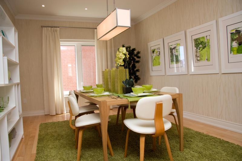
In the dining room I designed for a new town house, the overall mood was serene and Zen-like. Crisp white and bright green hues appear fresh and contemporary alongside the natural maple floors and dining table. A series of modern prints have simple white matting and matching frames creating a cohesive lineup that enhances the room's character. When hanging a series of prints or photographs in a group where the sizes and subjects differ, it will look like a bit of a jumble unless you choose one thing to connect them. The easiest solution is to have matching frames -- basic black or white with white matting, but the size of the matting can vary. Consider the proportion of pictures to wall space. Experiment on a piece of paper or set out on the floor before banging in the nails. Enjoy exploring different art forms together; these pieces will be with you for years along with happy memories of discovering something you look forward to viewing on a daily basis.
Dear Debbie:
My bathroom fixtures and countertop are grey, the flooring is taupe and grey and we have just put up some tiles we thought were grey but they have a distinctly baby blue tinge to them. Is it true that if you don't like the colour of the fixtures, then paint the walls the same colour and they will be less noticeable? Help. What colour should I paint the walls and ceiling?
-- Sandra
Dear Sandra:
No, I don't agree. In your case, with all that grey, it is going to look like a cave. You need a splash of colour. Orange would look amazing, but also yellow, which is hot hot hot this year. Why not paint the walls yellow and choose fluffy white towels for a bright, contemporary mix? The different shades of grey and taupe will recede with a warm, advancing wall colour.
Debbie Travis' House to Home column is produced by Debbie Travis and Barbara Dingle. Please email your questions to house2home@debbietravis.com.