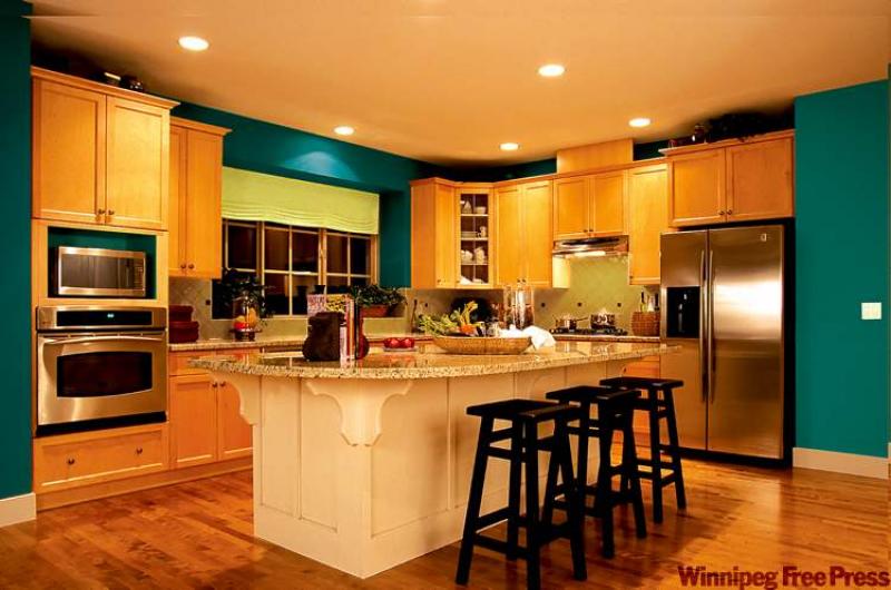
IF you're leery about using strong colour in your décor, the best way to get your feet wet is to use it in small doses. Our feature photograph, courtesy of CIL, boasts two vibrant colours called Peacock's Plume with an accent colour on the backsplash area called Lime Twist.
The darker colour definitely makes a statement but is not overpowering or gloomy. This is because the actual painted surfaces only make up about one-quarter of the visual room space. The light cabinets break up the rich wall colour while the flooring and granite countertop maintain a light, airy feel to the room. The accent colour on the backsplash and window treatment is a fresh colour that keeps things light and airy.
Using bold colours on smaller wall surfaces like we see here is a great way to introduce rich colour without a full commitment. It will be an easy fix to repaint these small wall sections if you're not happy with your colour choice or when your tastes change down the road.
Other areas to try
The bathroom can be another great room for trying bold colour because the wall space is broken up by cabinets, fixtures and mirrors. Don't be concerned about using bold colour in a small space. Sometimes smaller rooms can take a strong dose of colour quite successfully. Remember, unlike a kitchen or family room, you're not in the bathroom for long stretches of time so it's less likely that a daring wall colour will offend your visual senses.
Areas of the home that may have light coloured wainscoting are another great place to dabble in daring wall colour. For instance along the upper area of a wainscoted stairway or dining room. Any artwork hung on the rich wall colour will further reduce any strong visual impact and will make the artwork really pop.
Lighting is important in any room but especially if you're using darker tones. Unless you are trying to create a cave-like atmosphere, say in a den or television room, you want to ensure that good, overall lighting is included in your decorating plans. The recessed pot lights in our feature kitchen provide consistent lighting for the room while accent lights highlight work areas.
Choosing the right colour
Choosing the right bold colour for your space can be difficult, especially if you're new at it, but there are a few tips that may steer you in the right direction. Try to stay within either a warm or cool colour palette depending upon your room.
You'll notice in our feature kitchen that the cabinets and flooring are made of a honey-coloured wood that has yellow undertones. This would be considered a 'warm' colour or warm tone. If you're working with warm tones you'll want to choose a paint colour that harkens from the warm colour family. The Peacock's Plume and Lime Twist paint are warm colours that work with the cabinets, as apposed to a cool colour like steel grey. The colour choice in our feature room is not for everyone but it still works because of the warm-warm connection. Other eye-catching colours like a warm brick red or orange could work well in our feature kitchen.
Don't fret just yet
Once you've made your bold choice, don't be derailed or concerned when the colour first goes on the wall. It may seem overwhelming since the walls will be bare of artwork or accessories. Once everything is back in its place everything will look different. Also, be sure to apply at least two or three coats to ensure a proper, consistent tone.
Like I've noted before, you can whet your appetite for bold colour in small doses. If not with paint, then with window treatments, area rugs, artwork, accent items (like toss cushions or small furniture pieces) or linens. Once you gain confidence with your colour choices then you are on to bigger and bolder things. Maybe you've always dreamed of having a red kitchen or dining room, deep purple bedroom or orange powder room for example.
Before you throw caution to the wind, begin in a room that is closed off from the rest of the main living areas. A bedroom or bathroom can stand on its own but if you put a rich wall colour in a dining room in an open concept home, the rest of the pale walls will seem out of place. Once you're comfortable with smaller space, then you can tackle the open concept or double duty spaces like a living/dining room.
Wall colour isn't permanent so what's the worst thing that can happen? You'd have to repaint. If you start with small wall spaces then the risk is minimal.
connieoliver@shaw.ca