Take all that negative news about financial meltdowns and environmental disasters and toss it out the window, because this year we're going full colour.
That's the word from decor advisers everywhere, whether you want to fill your interiors with fresh pastels or just add a jolt to a neutral palette.
We're looking for optimism, said Stephanie Pelland, colour adviser at Sico, Canada's largest paint company. People are looking for balance between the fast-paced world and simplicity, so they're focusing on the artisan, on nature, home and family values.
We're moving away from very dark tones, she says, and toward mid-tones and dynamic pastels. Now brown has red in it, pale grey is complimented with honey and mossy green.
This is really an authentic, timeless palette, she said.
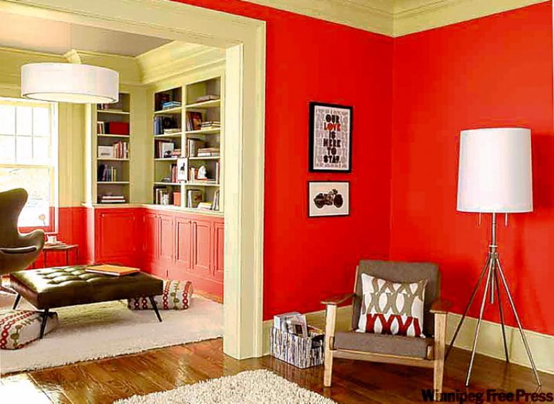
Reds have taken hold, says Pelland, sometimes touched with blue to become fuchsia or violet. Greens will also be seen in new blends and combinations, some with yellow tones, others with khaki. She advises lemon green in a kitchen to add a certain zest, and a leafy green in the bedroom. In this new decade we're seeing a fresher, more lively green, said Sharon Grech, colour expert for Benjamin Moore Paints. Green has been around every decade and regularly changes its tune, she says.
So it's no wonder it's now moving away from avocado and turning more of a yellow.
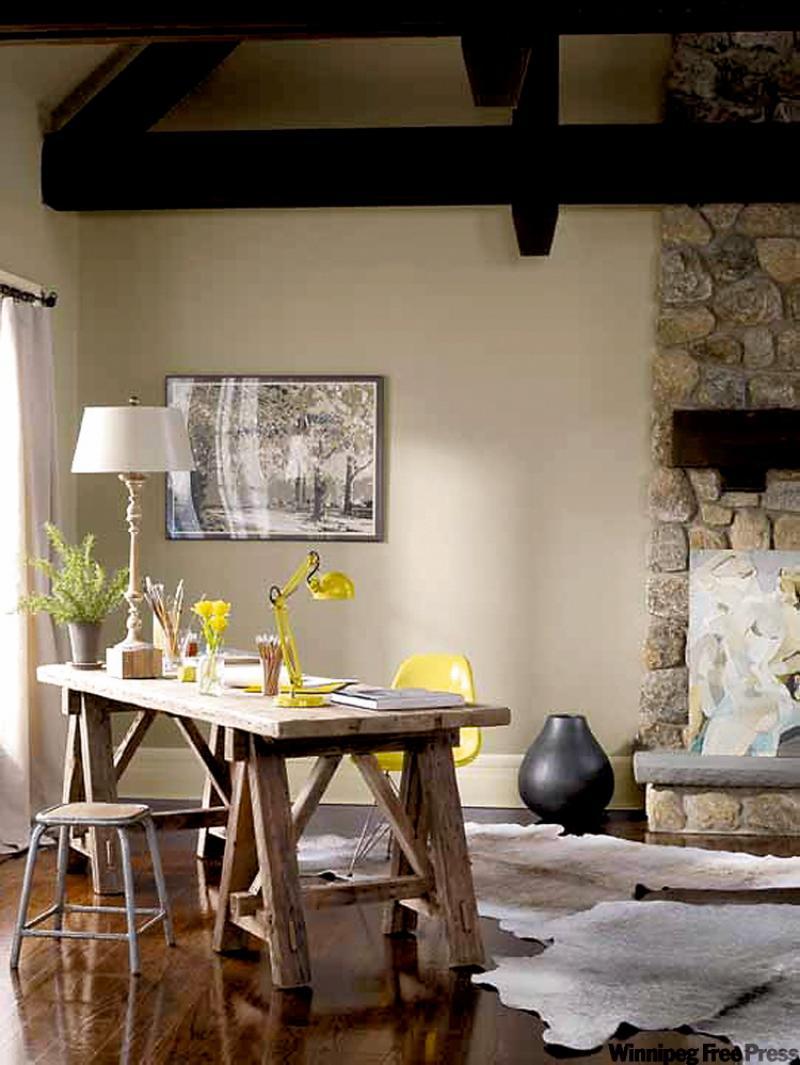
Against these shades, neutrals are strong, with grey in the lead, Grech says. We've been seeing them take away from the taupe and beige, especially in Europe.
This grey is definitely more of a background colour.
I would say that it's warmer, and takes the place of all the browns we've been seeing for the past five years, she said.
There's grey in their latest browns, such as Fairview Taupe, one of the company's historical colours.
And we're also seeing grey with a green undertone, she said.
The colour works beautifully as a backdrop to Claret Rose, a fresh orange-red.
Red was very popular for the last 10 years and everyone was saturated, Grech said. This is the first time we've brought red back into the trend palette. It's fresher and clearer.
The blues are definitely starting to come into the palette, she says.
I've been seeing it a lot in velvets and curtains and rugs. We'll be seeing more of a grey purple, a very pretty, feminine purple to signify a luxurious colour.
And now that browns have turned to shades of grey, mimicking stone, chalk and brick, they can be teamed with inky blues or brought into the open with a splash of citrus, say the folks at the British paint and paper company, Farrow & Ball.
They advise complimenting rich shades with golds and metallics, or injecting an accent colour like bright yellow against a dark backdrop.
I think the yellow is a strong colour, Grech said. The combination of the grey with yellow, grey with orange are part of the new palette.
But be warned about yellow, she says.
It's a really nice accent colour, but you might not want to use it on walls you're going to be staring at a lot.
Despite this blast of colour, neutrals still have a part to play, advises Pelland.
Pure white elongates corridors and brightens rooms while lightly tinted subtle whites like Cotton Ball are part of Sico's new palette.
All whites stand out against the warm tones of yellow, red and orange.
As for the beiges, tones which create a sense of security, the new generation brings richness and harmony to any room, in shades of tan or chestnut, says Pelland.
-- Canwest News Service