The forecast for 2010 is for lots of blue skies, says a colour expert with a leading Canadian paint brand.
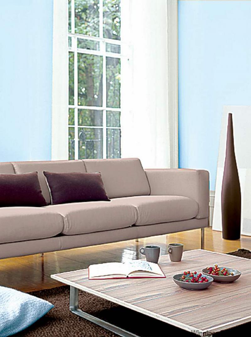
"The No. 1 colour is a clear sky blue," Jennifer Jones, marketing communications manager for CIL Decorative Paints, said in a telephone interview from her Toronto office.
"We're seeing this light blue coming out everywhere... It symbolizes optimism and new beginnings," she explained.
"It's also associated with nature and the environment. So it gives us a feeling of getting away from it all. It's refreshing; it's soothing -- one of those feel-good colours," she added.
Jones described the hot colours for 2010 as "really lively and cheerful."
"We're going to be seeing more energetic colours all around us in the coming year -- not just in home decor, but on the fashion runways, in all types of consumer goods," she predicted.
"People are becoming a little more adventurous with their colours," Jones said. "And we're encouraging them to continue that."
"In general, the colours have been a bit more muted in the last year or two," she pointed out. "Now they're a lot cleaner and a lot brighter."
Here's what Jones said we can expect to see this year:
* The new reds are very vibrant. They're replacing the previously fashionable neutral pinks and coffee-based reds. Clean, futuristic-looking pinks will be taking the spotlight. And we can expect to see a lot of coral tones.
* Oranges are very bright. Think pumpkin and carrot tones, and rich earthy copper browns. Oranges will have lots of yellow tones in them -- to brighten things up. They're moving away from last year's red influence. The new hues emit a bright and sporty energy.
* Yellows are soft and clean for the most part. Look for sunny yellow, citrus, honey, mustard and banana shades. Used on their own or combined with shades of blue, the new yellows are refreshing and comforting with a hint of pizzazz.
* Greens will have lots of yellow influence in them. Reminiscent of new plant shoots and beginnings, the new liquid-like greens exude a feeling of renewal, open space and freshness.
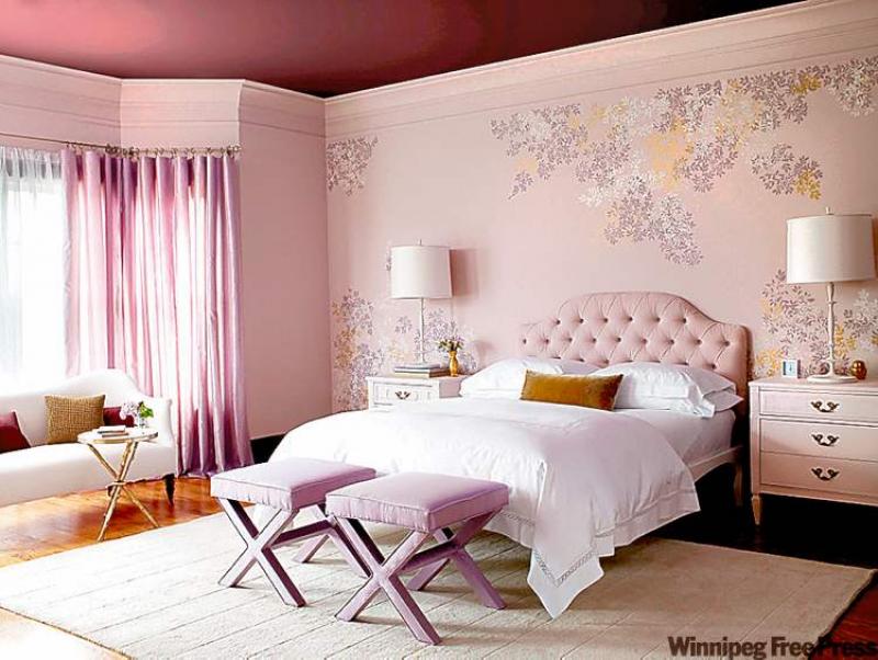
* Purples are very deep, very intense. The dramatic violets create a look that's both traditional and modern. For those not ready to experiment with intense violets, cool lavenders will also be in vogue in the year ahead, creating an elegant and soothing environment.
There are a lot more colours in the neutrals this year, Jones pointed out. Warm neutrals include beige -- rich beiges that are almost brown. They're not the washed-out, ultra-conservative beige of previous years. The new warm neutrals are deeper, infused with yellow-based earth, clay, sand and grain tones. For an ultra fashionable look, these warm neutrals can be combined with turquoises and teals.
"What we're seeing a lot of this year also is greys," Jones said. "Grey is kind of the new beige."
Fairly saturated greys are being used as neutrals, instead of beige, she said. These cool neutrals -- ash greys, near blacks and green slate tones -- are being used on walls, as well as the neutral accent colour with greens and vibrant reds.
The use of colour in people's homes can help lift their spirits, Jones said. And people will soon be able to select a mood to paint their home in on CIL's new website at www.cil.ca, which divides the colour palette into four mood groups -- each representing a feeling. They include: a mellow and comforting collection, which features serene and inviting colours; a soft and elegant collection, with colours that create a calm and sophisticated feel; a clean and playful collection, which features cheerful tones, often used in children's rooms; and a deep and luxurious collection, which has rich and dramatic colours.
CIL has even developed an online test to help people determine what mood they'd like to create and what ambience they'd like to create in their home. A colour co-ordinator tool is also being made available. When a colour is punched in, the colour co-ordinator will recommend a bunch of co-ordinating colours that are guaranteed to match. People tend to agonize over the choice of paint colours, Jones said.
"One of the biggest problems is people are afraid to experiment with colour," she said.
For those nervous about introducing a vibrant colour into their home, Jones recommended starting with a small room or an accent wall.
"People want that wow factor in their homes, but they get really nervous when it comes to using anything other than an off-white or a beige," she said.
"We're trying to give them the confidence to just try it." Pick a colour that you love, Jones recommends. Don't just pick a colour because it's one of the trends, she said.
"Make sure it's a colour that you love and that it speaks to you. Perhaps it co-ordinates with some items that you have. Feel good about the colour you're picking," she said.
"Our most important suggestion is to encourage people to try lively colours and bring their rooms to life," Jones said.
"Because it's fun. Putting colour in is actually really exciting -- and shouldn't be so scary."
-- Canwest News Service