AS a colour designer, I love busting colour myths.
One of the many of these floating around out there is that using several different colours will make a space look chopped up. If done badly, yes, that will be the case. But this is just one of many cases in which colour gets the undeserved bad rap.
It's like blaming the car for being a lemon, rather than the car manufacturer. Done correctly, even a multitude of colours can make a space feel cohesive, harmonious and engaging.
Just over a year ago, I worked with a longtime client on the renovations and colour choices for her new townhouse. When she called, I was very excited because this is a woman who loves colour and its complexity. Little did I know, I was in for a shock.
When I arrived, she told me she wanted to use white throughout the majority of the space. I put my disappointment aside and set about finding the best possible white for her new home.
My client wanted a modern, yet elegant feel for her home. To ensure a feeling of elegance, I knew I would want to use an off-white, and we settled upon Farrow and Ball "James White." The same flat finish was used on walls, ceiling and crown moulding to give all three elements the sense of being an architectural whole. With that beautiful Farrow and Ball finish, the walls looked as if they had been quarried from alabaster. Colour was used in the private spaces of the townhouse, but all public areas were done in white.
The client got what she wanted and I certainly couldn't complain about the results -- her home looked beautiful.
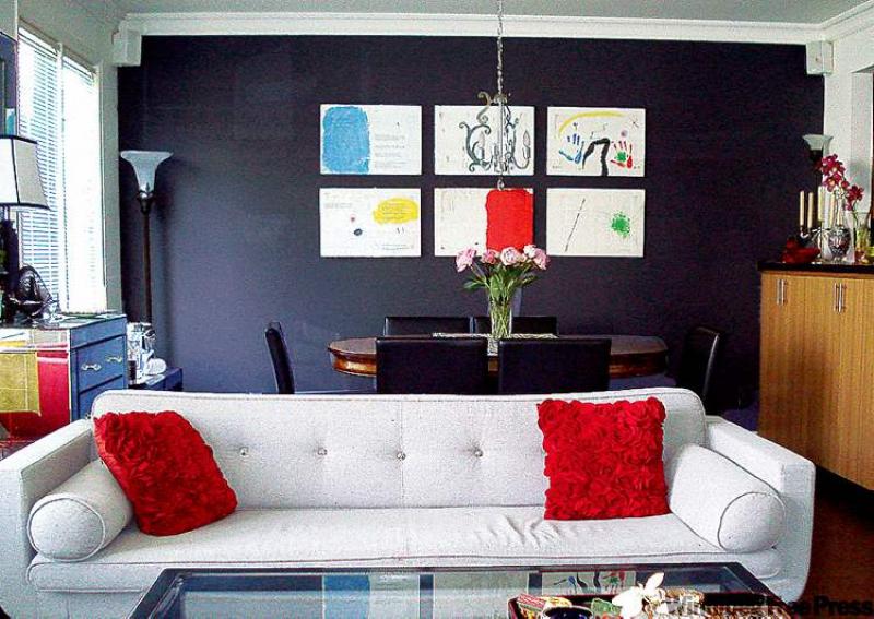
I recently received the call that I had always suspected would come. My client was tired of having so much white and was ready for colour. She had acquired new artwork for a large wall in the dining room that we both felt would look spectacular with a dark colour as its background; however, she still wanted to keep most of the walls white. I felt that if colour was to be added then it had to be done in several areas throughout the space in order to create balance, not just one wall screaming for attention.
The main floor of the townhouse comprises an open-plan living room, dining room and kitchen. For the dining room wall and its new artwork, we chose a colour that can only be described as a mix of purple, blue and grey. It's a wonderfully complex colour that's hard to pin down. It's dark and rich and when you look at it you can't make up your mind what colour it is. Soon enough, though, you don't care about figuring it out, you just want to enjoy it. It's so beautiful on its own that it actually took my client quite some time to hang the artwork.
The kitchen has zebrawood cabinets that extend to the ceiling. We had chosen black for both the countertop and the backsplash. My client tells me people constantly comment on what a sexy kitchen it is. However, I knew that if we put some colour on the kitchen ceiling, it would look even better. Two different shades of a blue-grey colour for the bulkhead and the recessed centre of the ceiling were used, with the recessed section being the darker of the two. Getting rid of the white ceiling was the final touch in making the kitchen feel complete. Your eyes now follow the dark vertical line of the zebrawood into two shades of receding blues rather than the abruptness of white.
On a small wall in the entrance area across from the dining room, we used another complex colour. Still in the purple-blue-grey family, but lighter this time because of how much white would be surrounding it.
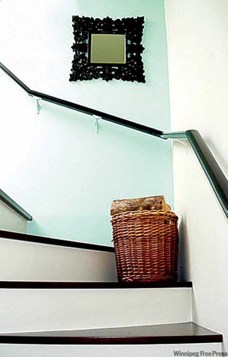
A small wall at the top of the second-floor landing was going to be a challenge.
It's a space that doesn't get much light, so normally I would suggest using a dark colour (another colour myth to tackle in the future). However, I didn't want that wall to be in competition with the dining room wall.
The colour needed to have a higher saturation level in order to hold its own in a dark space, but also had to maintain the elegant feel desired by my client. Ultimately, we chose a slightly desaturated turquoise and it's perfect. A flat finish was crucial, as any sheen would have robbed it of its sophistication. Another small wall at the top of the third-floor landing gets a lot of light, so this time we went for a lighter and bluer version of turquoise.
The new blocks of colour lead you around the room, giving it a wonderful flow from wall colour to art to furnishings. Artwork and furniture come alive now that colour is supporting and connecting all the elements. The colour at the top of each staircase acts as an introduction to that level. The darker green turquoise on the second floor harmonizes with the blues and greens used in the private spaces. The lighter and bluer turquoise leads you outdoors to the rooftop deck.
When the home was entirely white, everything felt disparate, as though each element was suspended in space without relating to other pieces in the room. Instead of chopping up the space, colour has succeeded in making it feel cohesive, harmonious and whole.
Key points to remember:
-- There must be an architectural logic to which walls will receive colour. Picking random walls will defeat the purpose and make the space feel disjointed.
-- Use variations on a theme. The four colours introduced on the main level all bear a family resemblance. The same colour over and over will leave people perplexed. Wildly different colours can easily lead you down the chopped-up path.
-- Saturation is important. Because we had used an off-white, we were able to harmonize with slightly desaturated colours, thus maintaining the level of elegance desired by the client.
-- Postmedia News