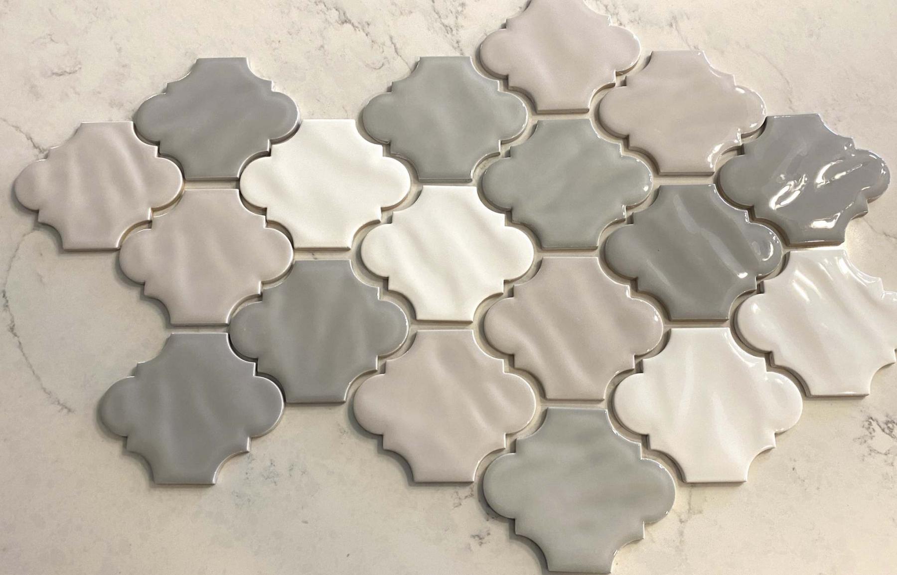
A layout pattern using individual tiles in four colours is pre-established before installation.
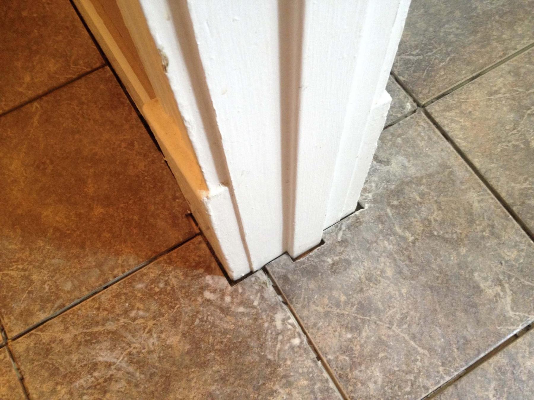
The layout of these tiles was configured to force a grout line through the doorway threshold.
While tiling the third floor of a huge home on Wellington Crescent a few years ago, it occurred to me how small the 12x12-inch tiles appeared in the largest of the areas. Conversely, the same-sized tiles used in a standard bathroom appear much more consistent.
Homeowners will spend much time choosing tile that meets all their colour and style requirements. They often also have tile size and style preferences in mind. Although these tile characteristics are obviously important, how the tile will be implemented should also factor into tile choice. Not all tile will suit all needs, and render some undesired results — an obvious example that comes to mind, is mistakenly using wall tile as flooring, which can result in tiles that crack because they weren’t designed to withstand a load.
Tile layout can also make or break a project.
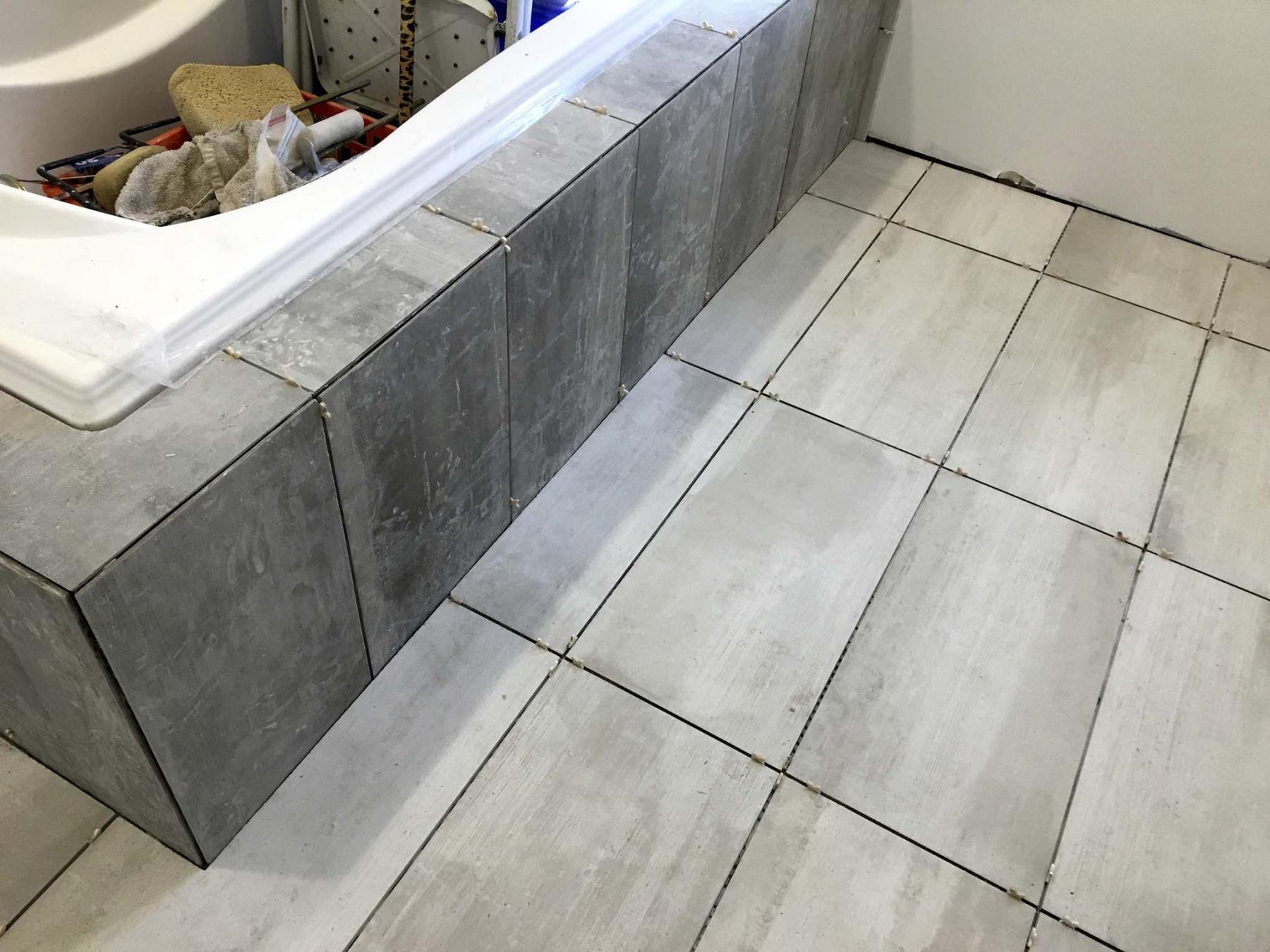
When tackling floor tile, the size of the tile must fit the size of the space. Whereas an average-sized tile in a smaller space will be easier to negotiate during install as opposed to a larger tile, the large tile will better suit a larger room. Moreover, how the tiles are laid out can also dictate the optics of the result. Despite the shape of the space, it is good practice to first place a single tile near the middle of the room and ‘map’ the placement of the entire floor. By doing this, ‘slivers’ of tile can be avoided by simply shifting the entire layout of the proposed tiling plan a few fractions of an inch or so, here and there. And it should be noted that assuming a 24x12-inch tile is exactly those dimensions will get you into trouble. It is likely this tile is closer to 23 and three-eighths inches, by 11 and five-eighths. Furthermore, factoring in the grout gap as you map will also affect the overall layout — the fluctuation in dimension of an eighth-inch gap versus a quarter-inch gap of a 12-inch tile over 12 feet reveals roughly 1 3/8-inches of discrepancy.
And it isn’t always necessary to centre a tile row. Although keeping tile lines parallel and perpendicular should always be the ‘rule’, tile placement can’t always be centred to everything. In a bathroom for example, centreing a grout-line with the toilet will appear visually correct as you enter the space if the toilet is facing and opposite the doorway. However, when the toilet is offset and along an adjacent wall in the room, it may be best to centre the floor tile within the entryway threshold. Although there really are no rules, you can use visual common sense.
Wall tile can also present its own set of challenges. The primary objective is to ensure the horizontal and vertical lines are of course square and plumb, unless of course the room itself is not — slight deviations to level may be required to avoid showcasing a wall that is slightly askew. Again, mapping the tile layout ahead of time will indicate the best course of action. I often use the term, the ‘big of the tile’, which essentially means avoiding smaller cut tiles when possible. An example of this, is a tiled walk-in shower wall. Assuming the room has an eight-foot ceiling, and the shower base sits a few inches higher than the bathroom floor, four, 24-inch (23 and three-eighths) vertical tiles will almost fit exactly. As such, placing the tiles in such a way as to require slight cuts to the lower edge of the bottom row and top edge of the top row will ensure the greatest ease of installation, allowing these cuts to follow any slight idiosyncrasies of the shower base and ceiling respectively, while keeping the ‘big of the tile’.
For a stand-alone unit, such as a TV and/or fireplace wall unit, centreing both horizontally and vertically becomes key. Depending on the size of tile versus the placement of the wall unit’s cavities (fireplace, shelf, TV etc), the tile layout will either bolster or hinder the overall appearance depending on the tile placement. Although avoiding slim cuts when possible remains the goal, it may not always be convenient. Again, trusting visual common sense will provide the lesser of all evils.
During a kitchen expansion and renovation earlier in 2020, the homeowners chose individual backsplash tiles in four different colours. The tiles were also oddly shaped. Unlike the conventional backsplash mosaic tile sheets that come in a pre-determined pattern, and are subsequently installed successively one after another, it was necessary to first establish a tile colour distribution pattern that both utilized equal numbers of each tile colour throughout, without necessarily creating an obvious pattern when seen in the larger scheme as a whole. After several attempts a pattern was pre-determined. By strictly adhering to the pre-ordained design throughout, the backsplash becomes a whole, as opposed to a bunch of individual tiles randomly strewn adjacent to one another.
To avoid a disaster you must determine the tile layout before you begin installation. By placing a few tiles along the intended surface and mapping out the entire design, your eyes will show you what your tape-measure might miss.
BossEnterprise@outlook.com