There are many factors that influence our plant selections when we visit greenhouses in the spring.
Some of these include rational choices based on thoughtful assessment of our garden space or an inventory of containers waiting to be filled. But how do we explain the rationale behind impulse purchases? I've never been one to ignore a moment of inspiration, even if it's motivated by coveting a plant or two in someone else's shopping basket (as in, 'I'll have what she's having').
Employing a euphemism such as 'specimen plant' can help explain why we have a particular plant in our garden that doesn't seem to go with anything else. The ideal, even when careful planning is usurped by love at first sight or plant envy, is to achieve maximum visual impact through the strategic use of colour and ensure unity and harmony in planting schemes.
Does this mean we should carry around a colour wheel? Undoubtedly, these are handy tools, but achieving the look we want can be as simple as making ourselves aware of a few basic principles. The two main components for successful use of colour are contrast and harmony. Simplify this further with an understanding of which colours are warm and which are cool. Colours that include red are so-called fire colours (reds, oranges and yellows). Greens, blues and violets are cool colours. Warm colours are on one side of the colour wheel, and cool colours are directly opposite.
Combining colours that have something in common creates a harmonious or analogous colour scheme, while combining colours that are opposite to one another, such as blue and orange or red and green, creates vivid contrast, or what is known as a complementary colour scheme.
Polychromatic schemes make use of all colours, as in a cottage garden style, while monochromatic colour schemes emphasize one colour or main hue, and all of its shades, tones and tints.
If colour theory makes you nervous, you are not alone. Textbook knowledge or innate understanding of the various colour concepts aside, many of us select plants based on a combination of popular trends and what's pleasing to our eye. We also get a little help from the folks at local greenhouses.
At a Proven Winners seminar a few years ago, Dorinda Penner, co-owner of Sunshine Greenhouse in Steinbach, was intrigued by the suggestion to group plants into colour blocks for easy selection by customers.
Penner was inspired to dream up the idea of creating large, moss-covered picture frames that serve as signage to denote colour sections she has filled with similarly coloured plants. The purple section, for example, includes red Abyssinian banana, which ranges in colour from deep claret brown to red-purple. Additional choices include purple oxalis, purple heart setcreasea, Brazilian alternanthera, with shades of hot pink and rose, and Blazin' Lime iresine, with rose-purple stems and bright golden veins, to name a few.
Contrasts work particularly well in groups of three. A scintillating combination might be a banana plant as the thriller, a colour-charged, coppery Keystone Kopper coleus with lavender-coloured undersides as the filler, and purple heart setcreasea as the trailer.
Alternatively, a somewhat calmer grouping might match Angelface Dark Violet angelonia with a mauve petunia, such as Blue Burst petunia with deep purple veining. Strobilanthes or Persian Shield would also be a good choice for this grouping, with its luminous purple foliage with glints of silver and deep green veins. Or, for a contrasting colour scheme, purple combines well with yellow or orange.
"Colour in the garden is a fabulous tool," says Penner, "because it connects us with so many senses in so many different ways. Yellow makes us smile, red and orange is warming, pinks are whimsical, and blues are cool and refreshing."
For her own garden, Penner prefers to combine warm colours such as pinks with oranges and reds, for what she describes as a salsa garden. Saturated shades of pink provide the most emphasis. An example might be Gaura Belleza Dark Pink.
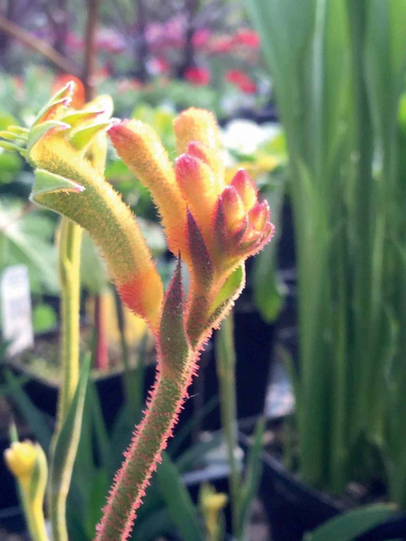
A more subtle take on a hot theme might be the use of a dainty plant called kangaroo paws (Anigozanthos), a medium-sized plant with fan-like rows of velvety, fuzzy flowers in red, yellow and orange atop slender, leafless stems. Penner has planted two of these in a small, olive-green pot and added a layer of moss. She recommends pairing it with a mini hosta (Mouse Ears, for example), but nothing that would overwhelm the small scale of kangaroo paws.
Penner also touts a minimalist theme that emphasizes the colour and texture of foliage and excludes blooming plants. The trend today among Generations X, Y and Z gardeners, says Penner, is toward monochromatic colour schemes. This is an age demographic Penner wants to attract. Less likely to select a triad or contrasting scheme, younger gardeners gravitate more toward foliage plants and succulents. Of course, interest in foliage plants is not limited to any one demographic, and there has been a noticeable increase in sophisticated all-foliage container designs, some with dynamic colour.
In one foliage container, Penner combined lime green ipomea with vividly coloured croton, Baby Tut and purple setcreasea. Inserting a pair of spiralled twigs adds dimension and vertical interest. To transition this same grouping to a more masculine theme, Penner suggests using five-centimetre thick stems of white paper birch instead of slender twigs. White birch is also useful for a nautical or water theme, a popular trend that combines plants in blues and whites.
Silver, grey or white harmonize with most colours and can be used to tie together a colour block of analogous colour with one that consists of contrasting colour. The silvery leaves of pulmonaria or lungwort, for example, are effective at adding light in a shady area or providing a luminous backdrop to flowering plants, making hot colours appear all the more brilliant. Alternatively, pairing white with greens, blues and pale yellows will enhance the sense of coolness.
White also helps ease the intensity of certain plant groupings and leads our gaze from one area of the garden to another. Two popular choices for accenting a container design with white are Diamond Frost euphorbia and alyssum.
Chartreuse is a versatile colour that goes well with almost anything. A cool colour, we often see it paired with warm colours such as red, pink or orange. Chartreuse also pairs well with purple. Chartreuse-coloured Pineapple sage, Wasabi coleus or Lime Time coleus are excellent substitutes for ipomoea or potato vine. Goldilocks lysimachia is a favourite trailing plant that is more chartreuse in a shady location but looks more yellow in full sun. Strong light can cause some colours, particularly pastels, to fade.
Recently I visited Red Valley Plant Market at 3091 St. Mary's Rd., which celebrated its grand opening this month. Owner Diane Whitley has created a number of plant combinations that emphasize both colour and texture. Calla lilies, for example, bloom for about four to five weeks. Once the bloom period ends, the interesting foliage, particularly speckled types, add texture to a mixed planting.
For a nautical theme, Whitley suggests pairing FlashMob Bluerific petunia with Blue-eyed Beauty osteospermum and Phloxy Lady Denim Blue. These same colours could be successfully combined with flowers in pink and white with the addition of silvery grey foliage plants such as Dusty Miller for a pretty annual border or container design.
With so many plants to choose from, it's easy to come home with a kaleidoscope of colour and then shrink at the prospect of creating combinations. Whitley suggests pairing plants with intense patterns, such as Mint Mocha coleus or Coleosaurus coleus, with solid coloured plants to create balance.
Placement of plants is an important component of designing with colour. A container design planted with a symmetrical arrangement that blends repetition with colour echoes will be pleasing rather than exhausting. Similarly, repetition and colour echoes are important in planning a perennial bed, providing unity and cohesion to the overall design.
In addition to emulating colour and texture in your design, consider the use of plants with similar form to assist in unifying your space. Plants with spiky leaf margins or mounding habits or plants that shoot skywards or cascade downwards all serve to add interest.
colleenizacharias@gmail.com
NOTICE: Celebrate Arbor Day today at St. Vital Park, from 10 a.m. to 3:30 p.m. Activities include tree climbing with the pros, zip-line rides, and rides in the bucket trucks. Sponsored by Trees Winnipeg. Free admission.
CORRECTION: Incorrect information was published in the May 16 Gardening column. The rooftop patio at Ashdown Warehouse condominium was designed and constructed by Scatliffe+Miller+Murray Inc. Landscape Architects & Planners and Gord Taylor of GT Shelters. The screens were designed by Scatliff+Miller+Murray and built by Gord Taylor using Pedra wood. The bench and table were designed and built by J Neufeld, Wood Anchor.