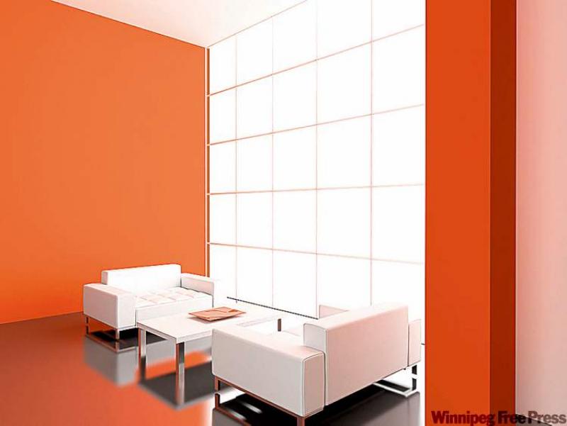
Dear Marc: I have been trying to select colours for my living room for about a month now. I just don't know how to go about doing it. I visit paint suppliers and look at swatches, place a few together, then bring them back home, but I just can't decide! Help! -- Angela
Dear Angela: Your home is a special place you can call your own. Therefore, it's only natural that you want it to fully reflect your tastes. Many homeowners have complained about how designers make it look so easy when it comes to colour. Well, the truth is, designers simply follow a few simple rules and apply them to their projects.
When making your selections, keep in mind what a colour scheme is made of: a dominant colour and a few accent colours. The dominant colour usually covers two-thirds of all surfaces in the room, whether those are the walls, floor coverings or furniture. The accent colours are used to accent -- as in, set apart from the rest -- certain features in the room, such as the accessories and unique architectural elements. The key to successfully using your accent colour is: Less is more. If you use too much of your accent colour, then it dominates your colour scheme and it will overwhelm the eye. Accent colours are a great way to integrate your favourite bold colours into your design that would otherwise be too strong to be used as the dominant colour in your colour scheme.
Once you've established which of your colours should be used as the dominant and accent colours, consider how the colour will react to your setting.
Have you ever noticed how the colour on your wall changes, depending on the time of day and the amount of natural light coming through your windows? There are many different factors that will determine the overall success of your colour scheme. First, look at the light in the room. Does the room have any windows that bring in natural light? Is the room lit with the use of incandescent or fluorescent lighting? All these factors will change the final look of the colour applied to your walls. Fluorescent lighting tends to make colours look harsh, therefore, you might want to consider adding black to your hue to warm it up. It also brings out every flaw in your walls, therefore, it you have an older home with imperfections in the plaster, consider choosing paint with a less glossy finish.
The finished product will also look different, depending on the co-ordinates of the natural light. Is the natural light of the room coming through a north or south window? North-facing windows tend to cool down the overall atmosphere of the room and make it look cold and disconnected. To correct this, you can choose a rich dominant colour that will exude warmth, such as a deep red, yellow, or orange. Warm colours also help make large spaces feel warm and cosy, and cool colours, such as blue, green or purple, help make a small space feel larger. Use warm colours to lower a high ceiling and cool colours to heighten a ceiling or widen walls. Colour can do wonders to a space, as it can trick the eye without any walls needing to be moved.
Another great way to use colour to your advantage it to use it in harmony. We all have certain pieces in our spaces that we keep for convenience and function. We can harmonize these pieces into our design by applying the dominant colour to them so they blend into the overall design.
Colour selection is the most important part of your design process. Choose your colours wisely based on these rules of thumb and you won't regret it.
Dear Marc: I have lived in the same house since the '80s and the last time I designed anything was when I bought the house. I did everything up to date at that time but haven't followed the trends since then. I am sick of my outdated look and want to have a beautiful trendy home. What has changed since the early '80s? -- Jacqueline
Dear Jacqueline: The first step to changing your design from drab to fab is to admit that your design is in sad need of a facelift.
Take a good, hard look at your space. Look at what needs to be changed, what can be thrown out and which pieces you can easily modernize. Once you have taken inventory of your existing design, flip through design magazines and find a look you like.
Trends have changed a lot since the '80s. Chances are, your sofa uses the same fabric as your window coverings and that same fabric is also found on the accent pillows. That is what I call the boring look.
Today's trends are all about being bold and using things that would have never been seen together years ago and placing them together. How many remember the old saying blue and green should never been seen except on Halloween?
Well today, we look at designer spaces and we see blue paired with green everywhere. In the '80s, it was all about blending everything together. Today it's all about contrasting everything to make a statement. No more monotone design.
--Canwest News Service