Ahhh summer. It will soon be here, and with it comes a plethora of colour inspiration and ideas for your decor. Summer fruits and flowers bombard us with delightful colour. Let these summer hues inspire you to update your decor with a fresh, new look.
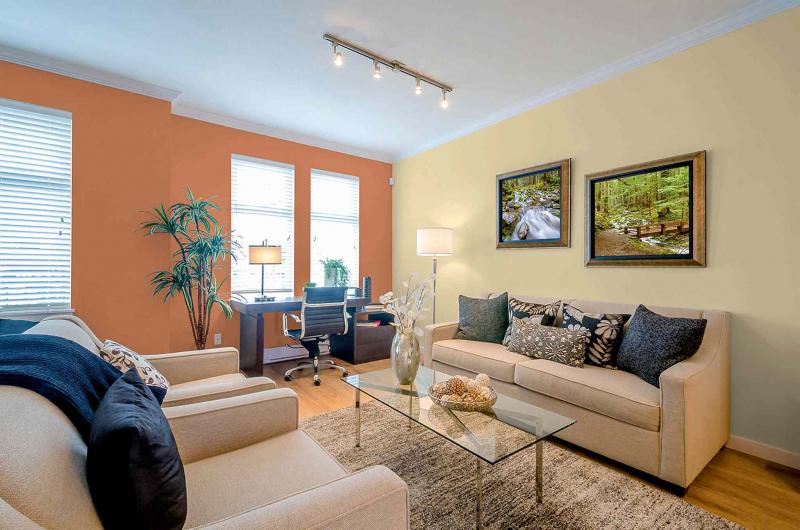
Our feature photo, courtesy of Dulux, boasts two cheerful colours reminiscent of summer melons. The cantaloupe orange and a yellow honeydew combination are unexpected and orchard-fresh in this bright and cheerful living room.
A matter of balance
As the furniture is light in colour and has no pattern, it's the wall colour that makes this particular space luscious and vibrant. Note both colours have the same visual strength. While the orange is more vibrant and would be considered the focal wall, the yellow is no shrinking violet and stands on its own beside the orange wall. If you used a pale yellow on the opposing wall, then the orange wall would be very dominant. While such a combination could work, it could also make the room look unbalanced. It's best to use the same hues when using more than one colour in this manner.
Try the unexpected
This particular colour combination is really unexpected. That's what makes it so interesting. While this particular palette might not be for you, there is a lesson to be learned here. Try unusual colour combinations if your decor needs a lift. Practise these new palettes in small doses (on a piece of paper or cardboard) until you find one that works for you. If you're really brave, try adding a third accent colour on a small space such as the wall over a fireplace. Hot pink or orange come to mind. Be brave, but play with colour combinations on a smaller scale before you commit.
Inspiration
As I mentioned above, you can find colour inspiration from just about anything, including summer fruits. Look to your wardrobe for ideas. If you have a great multi-coloured blouse, for instance, try out the colours as a palette for a room on a sample board. Look around your house for more inspiration. Perhaps a china pattern, a painting or the blooming apple tree outside of your window can spark your imagination. Nature rarely gets colour wrong, so go outside and notice the colour combinations found in nature.
Of course, the colour will look different in a room, but I want you to expand your horizons by trying unusual colour combinations, then using common sense when transferring those colour to your decor.
You may love the vivid red and white of a bowl of strawberries and cream, for example, but may not want to paint all your walls berry red. When it comes to painting a room in these colours for example, you may want to tone down the red to a softer pink along with a creamy white and use some vivid strawberry red accents to finish the look. That third colour I mentioned above? Perhaps the bowl the strawberries sit in is canary yellow. This could be the third colour to add to your space. It might be added via the window dressings, on an accent wall (such as above a fireplace) or in accessories. I hope you're getting the picture.
Yes, you can easily find colour combinations in decor photos and take your cues from there, but why use the palette everyone else is using when you can find a unique look by playing with colour until a combination speaks to you? Each of us reacts differently to colours and combinations as well as patterns and texture, so find the ones that inspire you, and your decor will be uniquely yours.
Connieoliver2015@gmail.com