Duravit / Tribune News Service
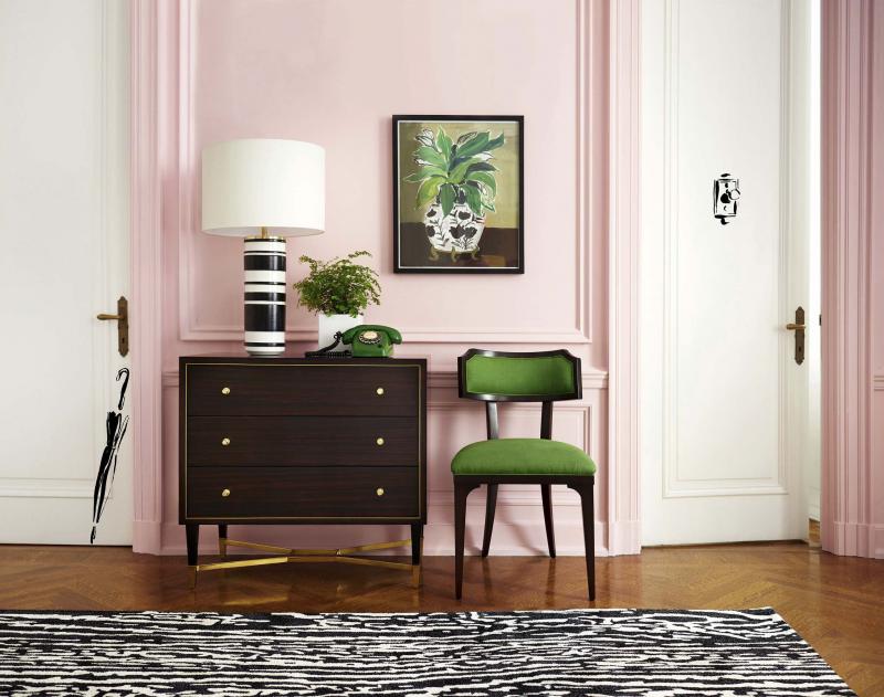
Pairing light pink with white creates a modern look.
Pink is one of those colours you can dress up or down and use all year long. Despite what many people may think, pink is more than just a feminine colour. From the runways to home decor, pink remains one of the most popular accent colours.
The foundation of pink
Pink comes in all different shades and tones. Many darker pinks have undertones of blue, which is why some of the deeper tones come to life when paired with blue.
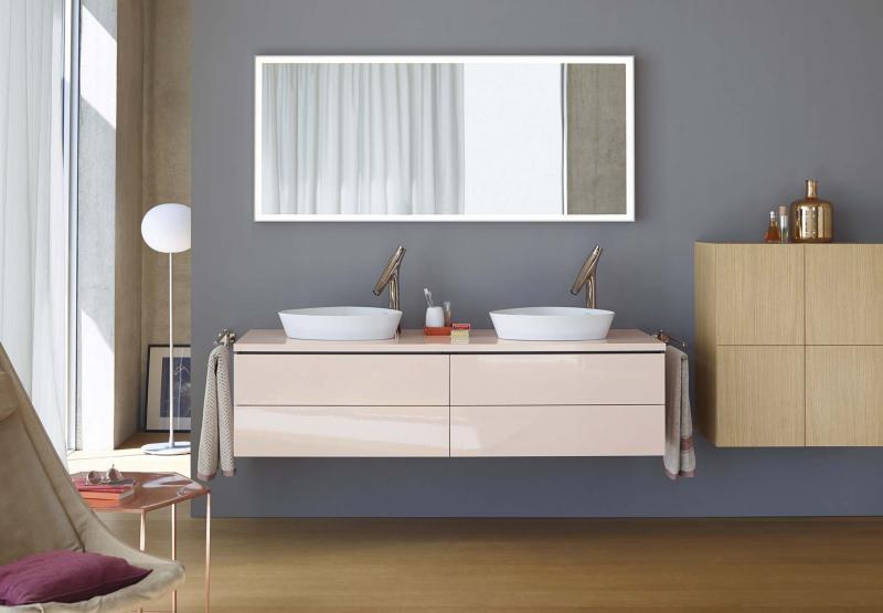
On the other hand, some softer tones have more cream or white as their foundation colour and work better with lighter shades, or can be used as contrast colours when paired with colours such as black or brown.
Tips for using pink
When looking for ways to incorporate pink into your decor, first decide if you wish to use it as a foundation colour for your primary pieces, as a dominant colour in your space or as an accent colour.
One of the best ways to use pink, or any accent colour, is through the use of a popular designer colour technique called colour mapping, in which colour is repeated throughout a space.
When using pink in your decor here are more top tips:
• Don’t be afraid to pair pastel pink or lighter shades with white. Many consider this palette to be fresh and modern.
• Lighter shades of pink can serve as great contrast colours when paired with darker colours such as black or brown.
• Don’t be afraid to mix different shades of pink in the same space.
• Consider using pink in unexpected ways in accent pieces, such as coffee table books and artwork.
• Don’t rule out hot pink! Hot pink remains one of the hottest accent colours in home decor.
— Tribune Media