Understanding paint colours is as simple as turning on a tap, says Brad Elkins, senior brand manager for Dulux paints: "Red is hot and blue is cold."
As for which end of the paint colour spectrum you pick for your walls, it really comes down to personal preference.
"The colours that work best in your home are those that work with what you already have," Elkins says. "I can tell you what the hot colour is for 2012, but if you put it on your walls and hate it, then it's not so hot."
Fortunately, within the spectrum of hot and cold there are a lot of options in between -- whether it's red, yellow or orange at the warm end or blue and violet on the cool side.
"Technically speaking, warm colours have longer wavelengths and cooler colours have shorter wavelengths," says Sharon Grech, colour and design spokeswoman for Benjamin Moore. "Green is midway along the spectrum and is the most neutral of the colours since it consists of both blue and yellow. It can be warm or cool, depending on which undertone is dominant."
Of course, there are rooms where warmer walls really work and others where it's better to paint it cool. "In general, warm colours advance and cool colours recede," Grech says. "So a large, open space can feel more intimate and much cosier with a warm colour scheme."
Warmer hues also tend to be livelier and are ideal in rooms where you entertain, says Mylene Gevry, marketing communications manager for Sico. "For instance, warm tones are great in living rooms because they stimulate conversation and encourage people to sit around and talk."
Picking paint colours is really a matter of deciding on the mood you want to set in a room. "There are no hard-and-fast rules when it comes to choosing warm or cool colours," says Alison Goldman, marketing communications manager for CIL. "It's more about what you love most and the emotions you expect to feel when you walk in a room."
Rich, warm colours tend to be more traditional and are often found on the walls of libraries, dens and intimate dining rooms where people like to gather and linger. "Dining rooms are often done in reddish tones, which increase appetite," Goldman says. "Warm colours are generally conducive to food, family and bringing people together."
The key when working with warmer tones is to bring balance to the room to prevent it from feeling too suffocating. "Using the airiness of a cool colour as an accessory or accent is a good idea," Goldman says. "That way you don't walk into a room and feel as though someone's thrown a heavy blanket over your head." For instance, in a room with a coral red shade on the walls, she recommends adding an accessory like acid-green throw pillows to provide contrast.
You can also tone down the intensity of a warm room with furnishings and trim, says Nancy Bollefer, Canadian marketing manager for Behr. "Creamy-toned furnishings offer visual relief against the warmth of a wall colour, especially when paired with a cooler-toned window trim."
Lighting also makes a big difference to the look of a warm room -- the wrong bulbs can suck the warmth out of even the reddest walls. "Everyone is moving toward energy-efficient lighting, which is great, but sometimes it can completely change the colour of a room," says Neil Jonsohn, a principal designer at Union31 in Toronto.
While an incandescent bulb is a toasty 2,700 Kelvins, eco-bulbs are often bluer and colder, reaching up to 4,000 or 5,000K. "If you've chosen a warm colour for your walls, it's best not to go cooler than 3,000K," Jonsohn says.
And, when it comes time to test your paint choice on a wall, Grech recommends looking at all the colour aspects of the room, including flooring and furnishings. "All colours have an element of both warm and cool," she says. "So when you view all your colour choices in one room, you can get a sense of their temperature relative to one another. A warm grey wall may look bluer and cooler when surrounded with white furnishings."
The fact this year's top warm colours are on the grey side makes picking paint colours easier because grey tones are less limiting and tend to go well with most decor, Elkins says. Here are some of the hottest warm shades for 2012:
Red
This year's reds, fortunately, aren't as intense as they were a few years ago, Elkins says. "The trend is luxury and refinement with a classic feel." For instance, Dulux's Stewart House Brown is a rich, reddish chocolate brown that adds drama to a room and also works well on an accent wall.
New for CIL is Tea Dance, a coral red with hints of yellow that would warm up any living room, Goldman says. Meanwhile, Sico's star colour is Ming Red. "It's a contemporary coral colour inspired by social media, so it's designed to showcase your personal warmth and charm through your decor," Gevry says. While Behr's elegant Bolero red illustrates how the colour temperature of a warm hue, especially a red, can be seen as a truly hot colour, Bollefer says.
Grey
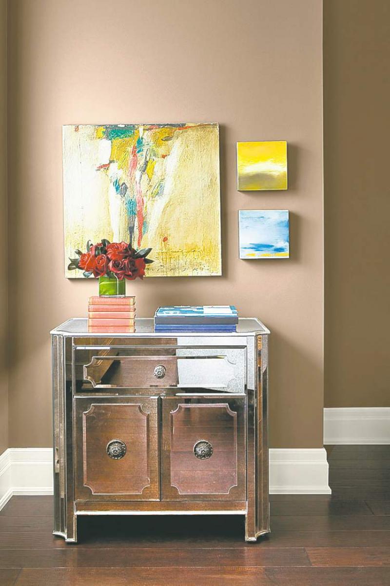
Smokey, warm greys are big for 2012. Dulux's Raindrop is a warm neutral grey with a yellow tinge that's ideal in a den or study, Elkins says. "It's perfect for a room that doesn't get a huge amount of traffic, but that you want to keep light and warm. On the other hand, O'Keefe Grey is a more traditional, beige-y grey that's ideal for hallways and other high-traffic areas because it hides fingerprints." Benjamin Moore also has rich new greys for 2012, including Stardust (see photo). "It's a warm, earthy grey with a chameleon quality that co-ordinates with most every hue," Grech says.
Yellow
Mustard yellows and smooth, creamy colours, such as CIL's Golden Ember, are especially popular for 2012, Goldman says. For Behr, Basketry acts as a neutral, but imbues warmth because of its yellow undertones, Bollefer says. "And, because it's a mid-tone colour, it provides the warmth many of us desire, without overpowering a room."
-- Postmedia News
Painting large
Got a small room you wish was twice as big? Use paint to convey largeness, say the paint professionals at Canadian paint brand CIL.
According to CIL, painting is the simplest and most economical way to make a small space appear larger. Not sure how this can be? Here are some tips:
Draw the line. Paint a horizontal stripe around a small room to make it look deeper and wider.
Be a colour schemer. Cool colours such as soft blues, purples and greens make smaller areas feel open and airy.
Shed light on the subject. Assess the amount of natural and artificial light coming into the room. Good lighting makes paint colours appear lighter, so rooms that have a lot of natural light may tolerate a warmer hue.
Avoid distractions. Paint the trim in a small room a different shade of the main colour so it will fade into the background. Also, use patterns sparingly.
Have tricks up your sleeve. Create the illusion of height by painting the bottom half of a wall in a darker colour than the top.