According to CIL paint, no matter the temperature outside, Canadian interiors will bask in warmth in 2016. The brand recently announced its top paint colours for the year ahead, bundled under the theme of tranquility.
Think brown-tinted neutrals, beachy driftwood tones, natural brights, cloudy translucent hues and soft pastels. These are warm, down-to-earth colours that promote a sense of serenity, according to Alison Goldman, brand manager for CIL paint, a brand of PPG Architectural Coatings.
"We're seeing a move away from the saturated greys, blacks and acidic brights that were popular the last few years," said Goldman. "The warmer 2016 tones deliver a more modern and livable colour scheme that translates beautifully into any living space."
The hottest colour of them all? Goldman says think pink, citing Chemise Pink (60YR 75/075 MC10) as the CIL paint colour of the year. "Soft blush pink will be incorporated in all elements of home decor in 2016, from walls to furnishings to accessories," she said, adding the new pink works particularly well with soft green, pale brown, chalky grey and slate. The inclusion of hues such as moss green, charcoal grey and brown-bag-toned shades, all reminiscent of military fatigues, contribute to the palette's protective feel.
When decorating with the 2016 colours, Goldman recommends completing your decor with trendy, gold-toned metallic finishes, which are "equally warm and make gorgeous accents to this palette." Gold metallic paint, in particular, can be featured on traditional elements in the home, from furniture, crown moulding and ceiling medallions, to wainscoting and fireplace mantels.
According to SICO paint, the year ahead is a golden opportunity to bring deep, lustrous yellow into your home decor. The brand recently dubbed yellow-gold as the "it" colour for 2016 and a huge decorating trend, delivering a warm, nurturing aura to living spaces.
Citing Buckwheat Yellow (6113-54) as the brand's colour of the year, Mathieu Hamel, assistant brand manager for Sico paint, explained golden yellow is reminiscent of both sun-kissed wheat fields and the dazzling vintage glamour of the 1970s.
"It's reflective of a less complex time in history and of people's increasing quest to return to cocooning, moving away from the fast-paced urban and social-media world in search of more natural living, simplicity, peace and refuge," he said, adding walls, furnishings, accessories and hardware will all have the golden touch in the year ahead.
Taking the top spot as the PPG Paints brand colour of the year is a soft, muted green called Paradise Found (PPG1135-5). With an earthy edge, it hints at nature while emitting a sturdy, shielding feel, echoing the popular urban militia-inspired look that is showing up on fashion runways. Pairing well with muffled plum and armour grey, the new green works particularly well in a family room, living area or bedroom.
According to DULUX Paints, it will be easier than ever to create a dreamy home decor in the year ahead. That's because the 2016 colour palette is filled with soothing, delicate shades of soft pastels.
"The 2016 pastels are a charming assortment of misty-coloured, comforting hues that build on the resurgence of last year's paler tones," said Martin Tustin-Fuchs, brand manager for Dulux Paints, in unveiling the brand's top colours for the year ahead.
"These aren't your mother's pastels," Tustin-Fuchs emphasized. "The pastels of 2016 are more natural and pigment-infused than the popular shades of the '80s -- subdued yet vibrant, muddied yet rich, and subtle yet strong." Picture sunset shades of pale coral, blush pink, sandy yellow, dusty grey, sea-foam green and earthy tan brown. Anchored by dark grey, black and light neutrals, the new pastels are livable and elegant in any decor setting, he said.
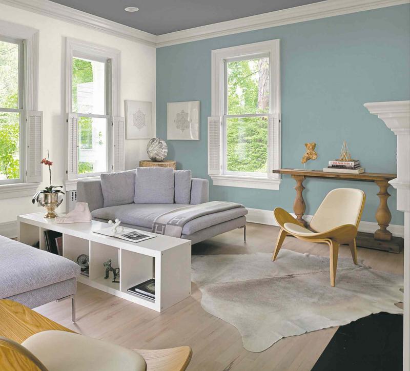
With a theme of Lucid Dreams, the Dulux Paints 2016 collection is highlighted by the brand's colour of the year, Bear Run (10BG 46/112), an ethereal blue that exudes calm and peacefulness.
Tustin-Fuchs offered these suggestions on how to incorporate pastels into your decor:
Pair with white. When painting with pastels, make sure to balance the soft tones and create a cohesive scheme by using an equal amount of white or neutrals in the room -- whether in furniture, fabrics, window coverings or rugs. Particularly hot for the year ahead is pairing matte and high-gloss finishes side by side.
Combine with brights. For a fashionable and cheerful look, play up pastel shades with doses of bright hues. Consider painting three walls in a pastel tone and the fourth in a bright colour, or liven up a pastel-themed room with bright accessories and bold-patterned pillows.
Balance with wood. Pastels are an excellent way to put a contemporary spin on a traditional space. A wood-pastel mix creates a beautiful and serene decor, while adding interest and equilibrium to the room. To tie the two together, pick a grain in the wood and paint the walls a pastel shade of that grain.
Mix with metallics. Increase the soft glow and romantic feel of a pastel-painted room by introducing metallics in accessories, frames and accent pieces. The new natural pastels work particularly well with trendy gold, bronze and brass finishes.
The right colour can make a room, so be sure to check out the latest trends these manufacturers have to offer for 2016.
Connieoliver2015@gmail.com