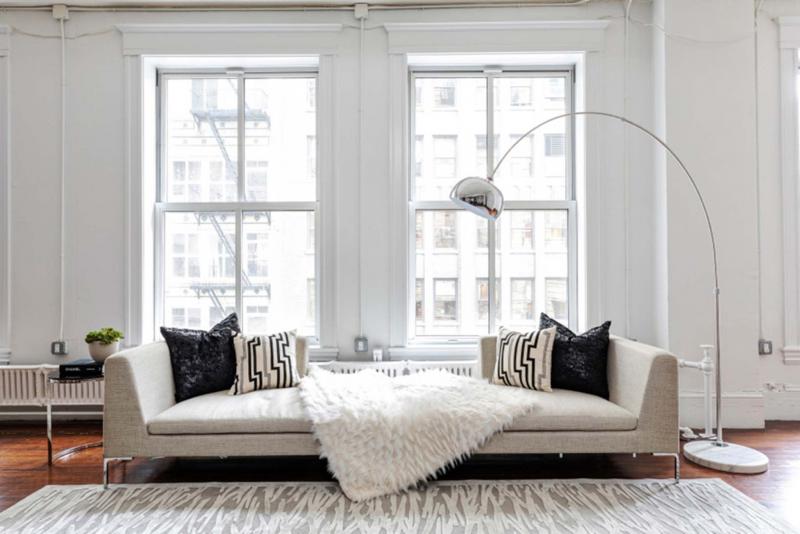
White has long been viewed as a formal colour, typically reserved for seldom-used living and sitting rooms. These days, those looking for a light, bright and minimalist look are choosing winter white. Unlike stark, bright white, winter white has cream and taupe properties that can serve as the ideal foundation colour for a neutral colour palette.
If you want to incorporate the beauty of winter white into your home, here are some tips.
DO:
• Blend different shades and tones of white in a single space. This is no longer considered taboo.
• Consider neutral or mostly white artwork. Artwork helps to make a statement as well as introduce or complement colours in a room.
• Pair winter white with other soothing colours such as soft grey or deeper shades of taupe.
• Consider metallics to complement white decor.
• Add winter white to the space in the form of accessories, consider using toss pillows or throws.
DON’T:
• Pair bright shades of white side by side. Slight off-hue tones may potentially look dirty when placed next to each other. Instead, pair slightly different shades of white with darker or more winter white shades of white.
• Place white furnishings in high traffic areas in which they may be susceptible to frequent staining. A more winter white or taupe colour palette may be best, as it helps to better to conceal.
• Forget white is a colour. Often the colour white is ignored, but it can be used just like any other colour — either as a primary colour for furniture and walls or as an accent.
• Overlook the opportunity to create a strong visual statement through the use of contrast. Black is a bold colour which adds the perfect sense of contrast.
• Ignore lighting. Lighting can be another opportunity to incorporate winter white into ones space.
— TNS