When it comes to deciding which way to go when you want a new colour, green is a great option for most any room. Along with the colour blue, it remains one of the most popular colours in decorating, and for good reason.
The colour green represents nature, growth and money. It is a calming colour often used in hospitals for that very reason. This colour, in most shades, also helps alleviate nervousness, depression and anxiety. These are positive traits to have in the home.
The various hues of green offer a range of colour choices. From the more yellow-greens like olive to blue-greens like teal, the options are endless. There are many co-ordinating accent colours that work with green, as you will see as you read further on.
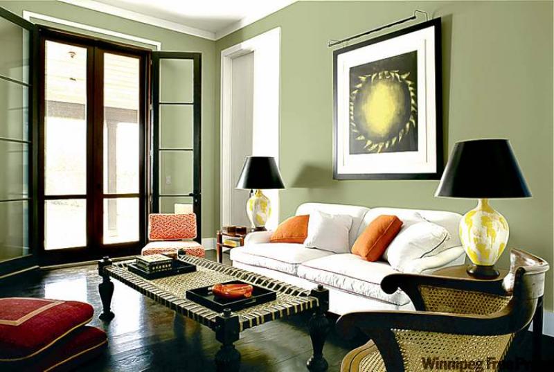
Our feature living room photo, courtesy of Pratt and Lambert Paints, is a great example of how this colour can work wonders for the home. This particular hue of green is subtle, but still visually rich. It is light enough so as not to be gloomy, but dark enough to pack a visual punch.
Even though there are a lot of dark elements in the room, the space still feels fresh and alive. This is mainly due to the wall colour, but also in the strategic use of complementary accents. As I've stated before, rich wall colour works best when it is juxtaposed with light-coloured trim. The white baseboards and door moulding make the wall colour pop. The addition of the white sofa and large painting with a substantial amount of white matting further supports this design strategy.
Unexpected accents: Using orange accents in this room is genius. Orange is not a colour that first comes to mind when using a green palette, but it's a refreshing look. The retro orange side chair is probably the culprit that gave the designer a jumping-off point for this unusual accent-colour choice.
This is a good design lesson to heed. If this were your room and you had this offbeat orange chair in the attic, you probably wouldn't even think about using it in your new room. We have to think outside the box and put weird things together once in a while just to see if it works. This is a good way to get creative, use what you have and create a unique space for yourself. It doesn't always work, but it's worth the effort when it does.
There are only four orange items in the space, so changing the accent colour down the road would be a simple update to keep things looking fresh. This is another good lesson on how to add non-permanent colour to a space. Using splashes of colour in accent items is the best way to achieve visual interest without a huge commitment in time or money.
The secondary accent colour is the pale yellow found on the lamps and the artwork. Even the stack of magazines in the side table have yellow spines, a conscious choice. A decorative box on the coffee table has pale yellow accents as well. No doubt the lamps were something that just had to be used because of their beauty, and choosing artwork with a yellow-green hue makes this secondary accent colour work. If you have something that you really love, like these lamps for example, and you want it to work in your space, bring in two or three accents in similar colours to solidify the look. The red floor cushions are another good example of this idea. The cushions have yellow piping, which makes them work with the other yellow accents, and by adding red piping to the sofa cushions, a third accent colour is born.
Eclectic decor can be lovely: If you dissect the items in this room, you'll notice that nothing matches except the one pair of unique table lamps. The three tables are all of a different wood finish and style, as is the chair and sofa, but they all work well together. The cottage-style casual sofa is an oddball choice beside the gothic coffee table and rococo cane-back chair. Throw in a 1950s-vintage armless chair and Moroccan-inspired floor cushions and you've got a real mishmash of furniture and accessories -- but it all works. Just because you can't afford matching furniture sets doesn't mean your space can't be stunning. You can successfully mix styles, genres and period pieces for a successful outcome.
Black touches finish the look: The black accents in this room give it a grown-up look. Black lampshades are an offbeat choice for such pale lamp bases, but look smashing. If you imagine them in white, you can visualize that they'd have much less impact. The look is harmonized with the addition of black table trays and the black frame on the artwork. A touch of black piping on the back sofa cushions adds to the impact.