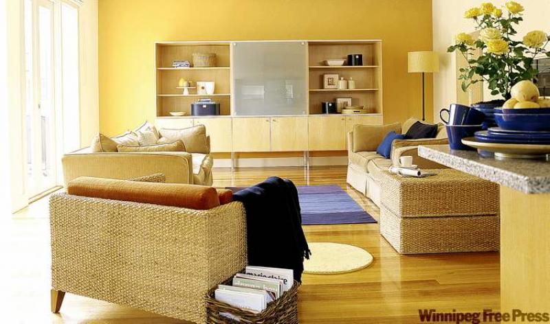
This lovely living room is serene and inviting. The buttery yellow Dulux wall colour, honey-toned floor and cabinetry and pale golden furniture are a winning combination. The large window provides tons of natural light, which further enhances the overall golden glow of the room.
Some may think a mostly monochromatic decor will be boring, and it could be if you didn't add in elements that give the room personality. If you're considering a tone-on-tone colour palette just be sure you mix things up a little with the other elements of the decor.
Our feature room actually has a complimentary colour scheme, by way of the blue accents, but the larger part of the space is in a yellow palette.
Texture adds depth
At first glance, the furniture in our feature photograph all appears similar. The colours and tones are, but the pieces in the foreground are woven wicker, while the sofa and love seat appear to be microsuede. There is no harsh colour, style or scale contrast, which is in keeping with the monochromatic nuance in this room, but the two furniture finishes give the room more visual interest. If you can imagine all of the furniture being the same, you can envision that the room wouldn't be quite as interesting.
The honey-toned wall cabinet is large but unassuming because again, there are no harsh contrasts in colour or cabinet hardware. Most of the accessories on the cabinet shelves are of a similar honey tone save for the few, strategically placed, darker accent items. The display still has tons of personality through the use of varying shapes and styles of accessories and, again, subtle texture via two round wicker baskets.
The larger square floor basket houses books in a casual manner while the throw rugs add texture and additional colour to the space. Note how the dark blue throw is similar to the dark accents on the bookcase shelves and one large toss cushion on the love seat. Though you may not be able to see them in detail, there are two soft cream-coloured toss cushions on the sofa to the left that are covered in a nubby fabric, which gives subtle texture to the sitting area.
A flowering potted plant with two tones of yellow blooms looks great in a blue ceramic pot. The plant adds texture and the yellow flowers support the gold tones of the room. Plants usually give a room that little extra life so they are a good accent to incorporate into your decor plans.
You may notice that there is no pattern in the room, save for the understated natural pattern in the wood floor. Forgoing pattern provides serenity to a room. If you want to include pattern in your tranquil space, ensure that it is a soft pattern with muted colour tones so as not to jar the eye or the senses.
About balance
Our feature room is all about the yellow palette with a hint of blue as an accent colour. If you take the room as a whole and divide the colours visually, the split is about 75 per cent yellow/gold tones, 20 per cent off-white and only about five per cent in the accent of medium and dark blue. The high percentage of the yellow tone gives the space a warm, calm feeling.
If you wanted a more lively and spirited space, you'd want to increase the use of the accent colour to about 35 to 40 per cent. If you break it down in these simple terms, you may find it easier to shop for accents. For example, if you wanted to jazz up our feature room with more accent colour you know that you need to make about 25 per cent more of the room's visual space blue. You could add this additional accent colour via a larger blue area rug, a blue accent chair in place of the wicker one and maybe one or two more blue cushions.
Skip the minutiae and just focus on the visual area that needs to be filled. Don't begin your decorating process by stressing yourself out about whether you should buy that blue lamp you saw at the store before you know how much of the colour you actually need, percentage-wise. This way, you'll at least have an idea of what direction to head in the decor store.
You'll notice how the blue accent colours are dotted around the room. Purchase accessories that will offer the same option. (For example, don't buy a bunch of blue vases just for the bookshelf without having the same/similar colour in one or two other areas of the room.) Dotting the accent colour around the room gives the colour significance.
Connieoliver@shaw.ca