Renovation & Design

Renovation & Design

Your little place by the water

Room for Change / By Connie Oliver
January 29

Renovation & Design

Anything goes

Ten years ago, it was easy to get a handle on decorating trends. A little faux wenge wood, a set of sky-blue-and-brown graphic bedsheets, and a whole lot of beige stuff in your all-beige house and you were in style. But whose house was that anyway? And where was the personal stamp? Admittedly, the many (sometimes conflicting) trends these days will make you dizzy. Plus, with websites and blogs reporting on the latest and greatest at warp speed, it's hard to decipher what was last year, five years ago or even five minutes ago.

But take a look at all the fabulously eclectic homes in magazines for 2011 and you'll see this broad spectrum of trends is a good thing. And in this time of bold, anything-goes decor, all you have to do is choose what works for you. We've come a long way in the past decade, and it's simply pointless to worry about any one single trend trajectory: It's all about the mix. More important, it's how you play that mix in your home.

Freshen up for the new year

No need to start from scratch. What I'm suggesting is that you add a couple of cushions, a new entryway bench, or perhaps wallpaper in the powder room. But steer clear of theme-room decorating and steer clear of blatant knock-offs or anything that looks cheap, says stylist and trendsetter Arren Williams.

Shop for things that will last -- items you can touch, hold and sit on -- things that feel real. Be inspired by the trends, not a slave to them, he says.

I love seeing what's new. Trend stories were my editorial beat for a long time. So without further ado, here's what we'll be seeing in 2011.

Patchwork

Patchwork is popping up on chairs, carpets, and quilts. While today's version features the hand-hewn details of yore, it's completely fresh and modern -- not old-granny like in the movie How to Make an American Quilt.

'A deliberate stirring of time periods'

According to Shawn Gibson, co-owner of the often ahead-of-the-trend retailer Teatro Verde, we're going to see a deliberate stirring of time periods, from antiquities, mid-century, '70s, to postmodern, he says. Each piece will read like an art piece, Gibson explains. Everything will have its own level of art, but it will have to breathe. The heavy art pieces will need to be balanced with light. We're headed for some very self-expressive times -- it's all about making it your own, he says. The great thing about these self-expressive times is anything you buy this season will stay in your style for years to come, especially if you love it.

Pattern, pattern and more pattern

Graphic, bold, floral, vintage, traditional reinterpreted with fresh colour: Yes, it's all about pattern. In 2011, it will be all over everything from bowls and plates to pillows and towels as well as large applications like furniture.

Big colour

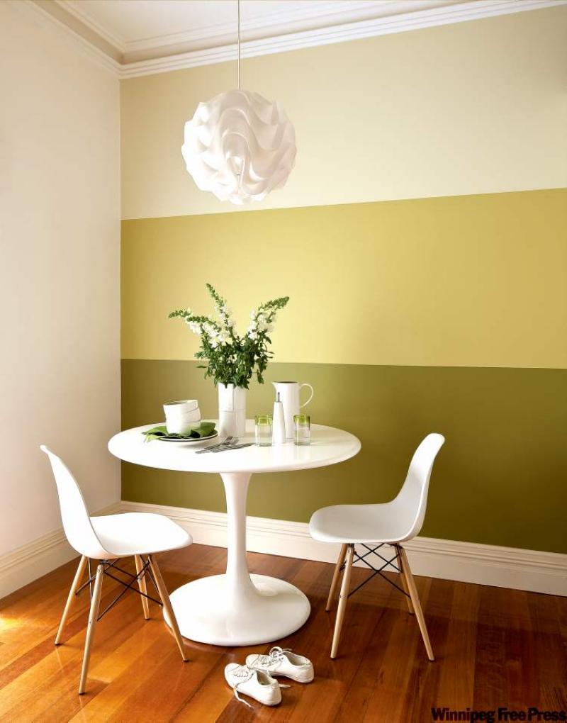
Hello bright, clear, cheery colours. Think of the saturated colours in the rainbow (just don't use them all together!).

Belgian farmhouse linen

On the flip side of colour and pattern, the Belgian farmhouse or linen look is still going strong. It's just become a little more gilded with elements such as gold lamp bases and metallic linen. The look is moody with deep sand-coloured walls, linen upholstery, and unfinished and raw-looking woods. It's easy to live with and ideal for anyone who wants a neutral backdrop for brightly coloured and patterned pillows, throws and accessories.

Vintage accessories and toys for kids' rooms

Parents are looking for toys and accessories that remind them of their childhood, so vintage-inspired and retro children's accessories and toys are a big trend, such as Gary Taxali for Indigo's line of inexpensive wooden toys. This look feels like a time capsule of my childhood playroom.

Wood

Wood has been a huge trend on the rise since the autumn of 2009. The relaxed look and ecological aspect of wood tempers the gloss of lacquered furniture and accessories.

Dark and moody

We've started to see black and navy rooms featured on the covers of magazines and we're going to see plenty more. In response to greige and pastel colours, navy, black and slate-grey paint is going up on walls. White, gold and colourful accessories (a mix of mod and trad) keep the look fresh.

Military hues

I think we're going to see a lot of military colour influences, says designer Tommy Smythe, whom you may have seen on the shows Design Inc. or Sarah's House. Khaki, army green, beige and battleship grey -- mostly (from) off the runways, but also because after the global recession, people are gravitating to the relative safety of neutral palettes, he says.

Black and white

We'll see black-and-white patterned rugs, pillows, wallpaper and bedding punctuated by colour. But no damask, please. I know I said it's hard to decipher trends -- that was so 2005.

-- Postmedia News

By Samantha Pynn
January 29

Advertisement

Renovation & Design

Consider colour, lighting in bedroom oasis

Dear Leanne: Our master bedroom has three-metre ceilings and our bed is a contemporary style with a low headboard and no footboard. The wood is espresso stained ash and the lines are clean. We have painted the walls Benjamin Moore HC-92 Wheeling Neutral. We were wondering what you suggest for the light right above the bed and what to do with the big wall above the headboard.

A: It sounds like you have the makings of a fresh and sophisticated oasis. With the colours you have in your space, I recommend you go one of two ways:

-- Use a splash of colour to invigorate the neutral colour palette. If you are not opposed to colour, consider bedding in chartreuse or burnt orange tones. Keep the main fabric solid -- busy patterns with bold tones can overload the visual sense of a neutral space. Your contemporary bed lines are simple -- keep the decor simple as well. Contrasting colours and patterns can be added in small amounts, in areas such as accent pillows and artwork.

The space above the bed can be designed using one oversized work of art or a combination of smaller, related pieces. Frame your art in espresso or nickel tones that support the clean lines of your furniture. Look for works that incorporate splashes of the colour used in the bedding to provide additional visual impact.

The light above the bed can be jewelry for the room, but should not distract from the focal point, your bed. There are marvellous lights available such as halogen lights encased in sheer fabric shades. Check out your local lighting studio for some creative designs, keeping your metal selection similar to the frames and shade colours compatible with the colour scheme.

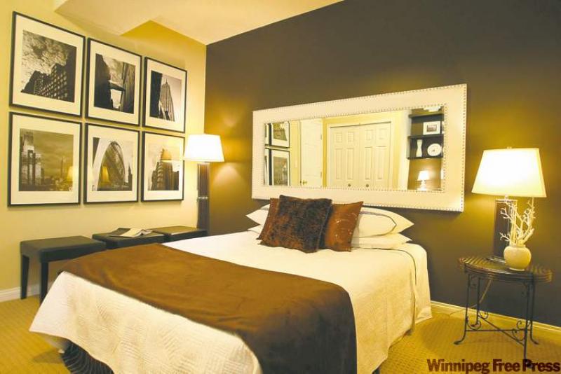
-- Keep the colour palette neutral. Add a luxurious duvet covered in white cotton. If you choose to add accent pillows, consider keeping them white, rather than an accent colour. Use the wall spans to showcase enlarged black and white photography. These can be particularly special if they are photos taken during a favourite vacation or event. A sheer drum-shade light above the bed would be a perfect balance to the monochromatic sophistication that your room will exude.

Leanne Brownoff is an Edmonton interior design consultant who welcomes your questions

at leannebrownoff.com.

-- Postmedia News

By Leanne Brownoff
January 29

Renovation & Design

Beautiful converts

By Todd Lewys
January 29

Renovation & Design

Fresh, cheerful colours dominate 2011 palette

Room for change / Connie Oliver
January 22

Renovation & Design

Style lines an important choice

Connie Oliver / Room for change
January 15

Renovation & Design

15 resolutions to help make your life easier

Resolution Solutions for 2011

1. Resolve to have better smelling feet. Sprinkle baking soda directly into your boots, sneakers or shoes. As you know, baking soda absorbs odours, so why not begin the year with fresh toes? Or soak your feet in tea each day to cut down on odours.

2. Resolve to handle spicy foods. If you eat food that is too hot to handle, don't reach for a glass of water. The best solution is to drink milk.

3. Resolve not to eat rotten eggs. Put an egg in a cup of salted water. If it sinks, it is fresh; if it floats it's bad.

4. Resolve to keep veggies fresh. Newspapers lining the vegetable compartments of a refrigerator will absorb moisture and keep veggies crisp, longer.

5. Resolve to make clump-free pasta. Use a lightweight pot for boiling pasta, add salt and oil; water will come to its initial boil faster and will return to boil faster, too, saving time and preventing the pasta from clumping at the bottom of the pot.

6. Resolve not to waste. Save clean carrot scrapings, celery leaves, outer onion layers and vegetable peels. Freeze them in a sealable bag or plastic container. When you have a soup bone or chicken carcass, throw everything in a pot to make lovely homemade soup stock.

7. Resolve to open jars without help from anyone else. If you are at home, a rubber glove or bottle gripper will give you the power you need to get into the stickier ones. However, these are not always available, so carefully wind a rubber band snugly around the lid and twist.

8. Resolve to keep shower doors spot free. Apply mineral oil over your shower doors and tile surface. Wipe off the excess.

9. Resolve to remove all pilling on fabrics. When "pills" develop on clothing (small wads of lint) use a rough piece of steel wool, run it over the material and the "pills" disappear.

10. Resolve to hang all of the framed pictures sitting in your basement. The cheapest and best material with which to hang pictures is copper wire, of a size proportioned to the weight of the pictures. The wire is hardly noticeable, yet strong and durable.

11. Resolve to get rid of ants. Wash a large natural sponge, press it dry. Into the cells, sprinkle white sugar, and place it near where the ants are troublesome. The ants will soon collect upon the sponge and take up their abode in each cell. It is then only necessary to dip the sponge in boiling water. The sponge may be set over and over again.

12. Resolve to make your own furniture polish. Mix two teaspoons lemon oil and 1 cup mineral oil in a spray bottle.

13. Resolve to clean all of the baseball caps in the house. Set them in the dishwasher on the top rack, along with the dishes. When finished, reshape the bill, and put over a pan to air dry.

14. Resolve to buy fresh bread. Did you know each day has a different colour plastic bread clip? They are: Monday/Blue, Tuesday/Green, Thursday/Red, Friday/White, Saturday/Yellow. If today was Thursday, you would want a red clip, not a white tie which is Fridays (almost a week old). To remember the colours of the twist tie, they go alphabetically by colour -- Blue-Green-Red-White-Yellow, Monday through Saturday, skipping Wednesdays. Write this code down and keep it in your wallet.

15. Resolve to make zippers slide with ease. Zippers won't stick if you rub them with the edge of a bar of soap or a candle.

Reena Nerbas is the author of the national bestselling Household Solutions series. Her website is www.householdsolutions.org. You can contact her at Box 429, Blumenort, Man., R0A 0C0.

Solutions / Reena Nerbas
January 15

Renovation & Design

If you value a picture, you'll pay to frame it

OTTAWA -- We've all done it: gone to a frame shop to see about getting a photo, poster, painting or medals framed, and we've nearly choked at the $300 estimate. How is that possible when stores sell framed art for $29.99?

Experts insist there's a big difference between custom framing and the off-the-shelf, do-it-yourself variety. While these ready-made fixes are cheap and cheerful, don't expect them to last more than a few years, says frame-shop owner Heather Cairns, who co-owns Framed! on Bank Street with Paz Blundell.

Cairns emphasizes that the key to custom framing is longevity.

"Let's say it's a wedding photo you are framing," she says. "Well, at the end of the day, you are framing it because you want to look at it for a long time."

A custom job often involves the use of high-end materials such as anti-reflection and UV-filtered museum-quality glass, which has one per cent reflection compared with eight per cent on regular glass, and thick, acid-free archival mats and backing.

Cairns points out that many cheaper options, which are great if you have a lot of pictures or small photos to frame and not a lot of money to do it, are usually made of plastic, MDF (medium-density fibreboard) or pressed cardboard.

These options are prone to cracks and nicks, the finish can rub off over time, or the photo or art may slide outside the mat. A photo that's pressed against the glass of a store-bought frame may also discolour.

"What happens over time is the change in temperature and humidity that your house goes through causes a certain amount of condensation underneath the surface of the glass," Cairns says.

"And what will happen over time is it will adhere to the glass. It will become foggy, but also the photo will be destroyed. That's the whole purpose of the (thick) matting: to keep the photograph away from the glass."

Large posters are among the most expensive to frame, ranging between $400 and $600. To slash costs, she suggests mounting the poster on wood or canvas for around $100.

Depending on the finishes, the average eight-by-10-inch custom frame costs around $200, she says.

What a person won't get from a do-it-yourself project is guidance from experienced framers, who have the tools to properly display art.

"If you are going to the store, you are picking up a frame and you are trying to make it (the photo) look good in what you found," Cairns says. "So you are making choices that aren't about design; they are about convenience."

Cairns' shop sells ready-made frames, which are typically 11x14 inches or smaller, made from leftover materials. These frames, which range from about $12 to $60, are a great way to get good quality for a lower price. They're ideal for framing diplomas and small photos, or to use as accent pieces to complement a larger custom frame.

-- Postmedia News

Custom-framing costs

Low: A 14x18-inch black metal frame with regular glass and archival-quality matting.

Approximate cost: $180

Mid-range: Detailed 15x16-inch wood frame with silver leaf, anti-reflection, UV-filtered glass (the next step up from regular glass) and double-thick, eight-ply matting.

Approximate cost: $240

High: Gold-leafed 15x12-inch wood frame with UV-filtered glass and double matting (top one is blue suede with an eight-ply mat underneath), and museum-quality, UV-filtered glass.

Approximate cost: $490

By Paula McCooey
January 15

Renovation & Design

Chic and cheap

Carlos Mota's trademark bouquet is tight, with little space between the blooms, and low with the stems cut short.

In his new book, Flowers Chic & Cheap, he uses peonies to illustrate his technique of assembling the bouquet, but it works well with roses, carnations or chrysanthemums -- any flower with some fullness.

Clean the stems first of leaves or thorns, then start the bunch by holding one stem and adding two stems to make a pyramid shape, with one of the two a bit higher than the other: The tops of the two flowers should touch the base of the first bloom, so no stem is visible.

Add three more stems around the base of the two flowers, again making sure no stem shows. Below the three, add five or six more in the same way.

Tie the flowers with floral tape or a rubber band and clip the stems about two inches shorter than the container you're using -- a square vase is nice, or a teapot -- so the flowers cover the edge of the container. Then add flowers randomly in groups of two or three to give the bouquet depth.

Flower tips

Some tips from stylist Carlos Mota on incorporating flowers into your life:

-- Don't be afraid to play with scale: Big flowers and big vases all look great in a small environment.

-- Put something small next to something big -- and vice versa. It gives you a good sense of proportion.

-- Try flowers in unusual places, even if it's just a single rose in a small bottle.

-- Consider single flowers in clear glass vases: They look nice in a group on a coffee table or in a row down a long dining-room table. Varying the stem lengths gives the arrangement movement and whimsy.

-- Use favourite ornaments and knick-knacks among flowers to create a scene. In his book, Mota illustrated with a white ceramic rabbit that appeared to be watching a row of peonies in slender-necked glass bottles and vases.

-- Use a pile of good-sized hardcover books to elevate a flower arrangement: It works well on a coffee table or an end table or in the middle of a book case. Mota used a few red books with two dozen rusty-red carnations and a short, wide vase. Once he'd cut the stems and placed the carnations, he added several mint sprigs randomly through the bouquet.

-- If you're using more than one container, try varying the number of flowers -- and their colours.

-- Mota likes to mix high and low: The book's cover illustration shows two pink peonies in a whimsical polka-dotted coffee pot, one cut shorter than the other. He likes to mix heirloom pieces with inexpensive new containers: a new teapot with an old silver one, say, or a tall vase of flowers and foliage paired with a smaller container of flowers cut short. Like your big brother walking with your little sister, I like to put something really tall and big beside something simpler and smaller.

-- A bowl of lemons can dress the dining-room table or a coffee table or an occasional table: Use different sizes of bowls -- a small bowl with small green limes, a medium bowl with lemons and a large bowl with a combination of both. Add greenery between the pieces of fruit.

-- Make it easy for the flowers to drink: Cut soft stems at an angle and smash the woody ones with a hammer. Use room-temperature water: throw a drop of bleach or a few pennies into the water to inhibit bacteria and remove leaves or thorns from the part of the stem in the water. Change the water every other day.

-- Postmedia News

By Susan Schwartz
January 15

Renovation & Design

Colouring your world

With a seemingly infinite number of colour choices to peruse, standing in front of a wall of paint chips is one of life's deer-in-the-headlights experiences.

You may have walked in dreaming of a perfect hunter green for your office, but on the chip, that hunter green looks a lot darker than you expected. Maybe Reef Green is more your speed, or True Green. But maybe True Green has too much blue in it. Suddenly you're thinking green may be better suited to your front door than your office. And with all the decorator magazines featuring white walls these days, maybe white's the right choice. Who knows?

Designers know. They know all the trade secrets on everything from paint brands and finishes, how to choose the right tones for the right room and how to avoid colour choices that would make even the mailman cringe.

"If you want to change your rooms, paint is the most affordable luxury," says interior designer Scott Yetman, "because even the most expensive paint only costs $90 to cover 500 square feet of wall space."

Yetman and Julie Charbonneau, of the design house de Poitiers Inc., are two of Montreal's top interior designers. The two advance the general idea that paint colour choice is the image of the little black dress, a base that can be accessorized with diverse textures and colours. And when it comes to choosing a colour, both designers are in neutral territory.

"My interiors are neutral in colour," Yetman says. "And it's not necessarily even about colour, but about the concept: Is it open and airy, or cosy and more noticeable? I prefer a neutral space with art works, accent colours and textures."

Charbonneau concurs: "Neutral is safer," she says. "I'd rather see colour on the cushions and the curtains."

When these designers say neutral, they're referring to earth tones and off-whites, not pure white. "White is not white when you put it next to a colour," Charbonneau says. "Benjamin Moore's Halo looks grey next to a sheet of white paper. Neutrals can be seen as cold, but in the end, they're often warm and relaxing."

When speaking to designers, specific colours are rarely mentioned. Instead, the talk centres on mood. "The rule of colour 101 that I learned years ago at designer school was cool colours recede and warm colours advance," Yetman says. "Use warmer colours for a cosy space and cooler colours in a larger space."

Mention strong colours like orange, red and apple green, and their reaction is immediate. "I'm not one of those decorating junkies that uses colour everywhere," Yetman says. "I prefer a classic backdrop where you choose where to have your drama. Otherwise, people don't know where to look. With too much colour going on, nothing stands out. For contemporary paintings, the background should be neutral."

So devoted is Yetman to the idea of sticking to a neutral colour scheme that he painted most of his house Farrow and Ball's White Tie. He does, however, have one exception: "For antique maps or architectural drawings, the background could be a dramatic (i.e., dark) colour like hunter green, chocolate brown or brick red. I recently painted my den black and hung the walls with architectural prints. Over the fireplace, I hung a flat-screen TV, which doesn't show on a black wall but would on a white."

Yetman hesitates to recommend dramatic colour in a large space, though, because he fears it will be depressing. "I like blue for clothes," he says, "but on walls it can be gloomy."

When faced with clients whose children want their rooms painted hot pink or navy blue, Charbonneau has only one suggestion: "Don't listen to them. A whole room in bubble-gum pink is so pink you have no idea," she says. "But if they insist, it will be the palest pink or blue available."

Instead of filling your house with a mishmash of colours, Charbonneau suggests going with what's around you, carrying the outside in. "If you're in a house by the ocean," she says, "using robin's egg blue would be nice. And for a city style, a grey and white colour scheme works. It's important to select a palette and stick to it throughout the house. I'd say no way to a red living room and a green kitchen. See how the colours relate to each other, and keep the little rooms a shade or two darker."

Then there's the topic of finishes -- matte or glossy. Whereas designers were once keen on shiny trim and matte walls, that's changing. "I don't like to contrast everything," Yetman says. "If your walls aren't great, go matte, but lately I prefer the light lustre of an eggshell finish. Of course, there are always exceptions. I recently finished a dining room where we painted the walls a high-gloss yellow. With the mahogany antiques and chandeliers, everything just sings."

Charbonneau has definite views on baseboards and trim. "We play it too safe and nice," she says. "I like to see darker colours than on the walls, like a dark grey or green grey, which is more European. In England and France, you see that a lot."

She's also big on this new high-gloss trend. "For a change, I'm going to start to push high-gloss for walls and ceilings. It looks fabulous."

On the topic of coloured ceilings, the designers don't quite agree. While Charbonneau likes to use colours on ceilings instead of the traditional bright white to give depth to a room, Yetman has reservations. "When the ceiling is high or a point of interest, you can paint it," he says. "Otherwise, it will come down to you."

The two designers are completely in agreement, though, on the issue of special-effects painting. "I would rather kill myself than do that," says Yetman. "I'm just not a faux person. The only finish I do now is use cheesecloth with a glaze to emulate old plaster. It's about texture."

Charbonneau values the texture of paint so much she insists kitchen cupboards be installed, then painted on site, rather than spray-painted in a studio, saying, "I want to see the brush strokes. Otherwise, you might as well buy a plastic door."

Both designers agree the last reason to choose a colour is simply because you like it. As Charbonneau says, "It's not a sweatshirt."

"Consider what's good for the room," Yetman adds, "not the emotional reaction. Think of your house like a wardrobe. You don't walk around wearing orange suits, but an orange scarf is great."

-- Postmedia News

By Lesley Chesterman
January 15

Renovation & Design

Splash of personality

Paint by these numbers

THE secret to the right colour scheme isn't always found in design magazines or trendy paint samples at the store.

It's easy to follow the latest trends, but pre-fab looks don't account for the individual, according to Pat Wickware Tweten, an interior designer of 30 years. "It's more important to consider the personality of a client," Wickware Tweten says. "I try to use colour to enhance the emotion, to decorate with colours that reflect their personalities."

She says the use of either vibrant or subdued colours can affect the mood of a room's occupants, either infusing them with energy or creating an environment that calms and relaxes.

She offers the following tips to help people choose colours that match their personality, location and living conditions.

1. What is the function of the room?

Ensuite bathrooms, for example, should feature high-energy colours to help wake up occupants in the morning. Bedrooms should have calming colours to help homeowners relax and unwind. Love to cook? Give the kitchen a deeper, stronger and richer colour. Family/entertainment rooms, on the other hand, should have softer colours to foster relaxation.

2. Don't choose a colour in a vacuum

Always take into account the room's furnishings -- the colour of the couch, the pattern in window coverings, even the type of flooring -- before making a decision. The colour should tie together the different elements of a room.

3. Sunlight and artificial light

Calculate the number of hours the room will have sunlight. A bright room's colour needs differ from those of a dark room. What direction does the room face? Light coming from a north-facing window is cooler than light from a south-facing window.

In painting a room, Wickware Tweten sometimes uses a lighter hue on the wall opposite the windows. The side walls will be a shade or two darker and the wall with the window will be the darkest colour.

She says skylights are a good way to introduce natural light into a room but "be careful they don't turn into glare bombs."

4. Room size

Generally speaking, warm colours make a room seem smaller. Cool colours, such as blues and greens, open up the space. Attention should be given to scale. There is a need to balance the weight and size of furniture and bookcases. The size and shape of artwork can also help balance a room and introduce different colours.

5. Different hues of a colour

Simply lightening or darkening a colour can have an effect similar to using a dimmer switch on a light. Deeper shades soften a colour. Adding white takes the light out of a colour.

6. Outside colour

The outside of a house should look inviting and give visitors a preview of the interior theme. The colour should be chosen taking into consideration the neighbourhood homes and environment. "One of the saddest things (in a neighbourhood) is when someone plunks down a glare bomb that shocks the senses," Wickware Tweten notes.

7. Different rooms

A colour can be a common denominator and be used to tie the different rooms together. Wickware Tweten uses neutral or "relief colours" in hallways so that the eye can relax and get ready as it transitions from room to room.

-- Postmedia News

By Pedro Arrais
January 15

Browse Homes

Browse by Building Type